Chapter 03
Information Architecture
As I noted in the book’s overview, this is a work in progress and I’m sharing it here in draft form. The overall book isn’t finished, but I hope the chapters I’m publishing have some value as I finalise my work on the book.
In this chapter I’ll level up the complexity a little. I’ll take the idea of components that I explored in Chapter 2 and develop it to explore the creation of patterns, reusable solutions to user interface problems that occur frequently.
Once I’ve explored patterns, I’ll tie everything together to consider how we can use patterns, alongside components and objects, to build pages. With patterns and pages covered, I’ll stress the need to consider information architecture, so that we ensure our users can find their way to what they’re looking for.
Lastly, I’ll introduce a number of methods – iconic layouts, blockframes and wireframes – at different levels of fidelity, which are useful at different stages of the design process and which will pave the way for Chapter 4, where I explore user flows and getting from A → B.
Table of Contents
Overview
When we design an interface, it’s important to put some thought into our overall information architecture. Information architecture is focused on organising, structuring and labelling content in a way that eases users through the overall information presented.
Our goal as designers is to:
- help users find the information they’re looking for; and
- enable them to complete the goals they aim to undertake.
In order to do this, it’s important to put some thought into how the different elements we use in an interface fit together as part of the overall system within which they exist.
To design an effective information architecture, we need to consider the structure and hierarchy of our content at a range of different levels:
- The Pattern Level
- The Page Level; and
- The Site Level *
The components and patterns we design – the content elements that make up our pages – will have their own structure and hierarchy, that we need to consider at the micro-level. As we design patterns for user interfaces, we need to consider how their content is organised, logically.
Similarly, pages will have a page-level structure and hierarchy, that relates to the context in which they’re consumed, for example, in a browser in a desktop or a mobile context. How pages are laid out, with a considered hierarchy, will help users achieve their goals.
At the macro-level, we also need to consider the overall information architecture of the site or application we’re building. We need to ensure that we organise our information clearly, ensuring users understand the overall structure of the site that enables them to build a ‘mental model’ of how everything is organised.
With an overview of this chapter covered, let’s get down to business and explore some further building blocks of user interfaces: patterns.
* Our site might, of course, be an app.
Section 1: A Pattern Language
In Chapter 2 I introduced the idea of Design Systems. In this chapter I’d like to introduce the idea of patterns and ‘pattern languages’ as I begin to explore the ‘Patterns → Pages…’ part of the interface equation.
A pattern language is a system for cataloguing and describing good design practice. The term was coined in 1977 by the architect, Christopher Alexander (who I’ll return to shortly). Essentially pattern languages are used to gather tried and tested solutions to design problems, for example, a login pattern that’s been shown to work through thorough testing.
The thinking behind pattern languages pre-dates design systems, as we currently understand them in user interface design, by quite some time.
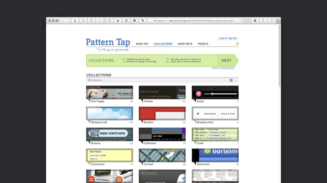
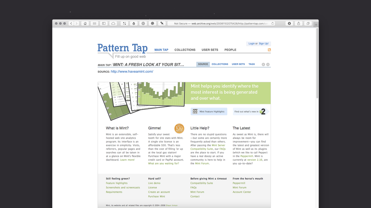
Pattern languages, as they relate to user interface design, were popularised by Pattern Tap, an influential website established in 2008 by the prodigiously talented Matthew Smith, which popularised the thinking behind pattern langauges and design patterns. Sadly, Pattern Tap is no more, lost – as so many websites are – to the ravages of expired credit cards and lapsed domain names. You can, however, explore it via the Wayback Machine.
Pattern Tap collected examples of user interface design patterns, largely as applied to the web. As Smith put it:
Imagine one place where you can drink deeply of great design patterns. Imagine you don’t have to sludge through design after design for the best pattern inspiration anymore.
The site allowed you to browse an extensive series of collections – all carefully curated by Smith – to find design patterns that solved a particular problem you were dealing with. It’s collections, amongst many others, included:
- forms;
- breadcrumb trails;
- navigation;
- logins; and
- footers.
Imagine you had to include a form on a website you were creating. Pattern Tap was useful for seeing design patterns for forms that others had designed to address this particular problem. As Smith summarised it:
Pattern Tap is here to satisfy and encourage the inspiration needs of my interface design peers. We aspire to be the one stop pattern shop for your next inspiration need.
As with my note of caution about the use of Dribbble in Chapter 2, the intention of Pattern Tap wasn’t to provide designs to raid for aesthetics, it was to provide different ways of tackling a design problem – using pre-existing patterns – that designers could learn from. In essence, Pattern Tap was focused more on design principles – methods and approaches – and less on surface-level, aesthetic inspiration.
Pattern Tap may have disappeared into the great big website graveyard in the sky, but its resources were acquired by ZURB in 2012 and it lives on – in a new form – at ZURB Library, a set of resources that ZURB has been gathering since 1998.
In addition to ZURB’s Pattern Tap, other pattern libraries have surfaced to gather patterns in single, centralised locations.
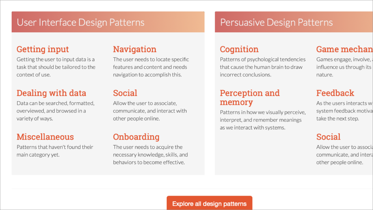
UI Patterns – created by Anders Toxboe, a Danish web developer – is an extensive collection of design patterns gathered together in one, centralised location. As the detail (above) shows, it collects User Interface Design Patterns – navigation, dealing with data, onboarding… – so that designers can explore pre-existing examples of solutions to user interface problems.
UI Patterns is very much a successor to Pattern Tap and is well worth bookmarking. As Toxboe puts it:
By not only listing different ways of solving common design problems, but also rationalizing about how, when and why such solutions should be used, [my] goal is to create a tool that will help end feature debates, get a clear understanding of why we’re doing what we’re doing, and why we’re not doing what we’re not doing.
Where UI Patterns differs to Pattern Tap is Toxboe’s approach, which adopts a more crowdsourced philosophy. Toxboe states: “UI Patterns is a personal project, but it is extremely open to contributions.” The result is a comprehensive resource that will help you to develop an understanding of the power that lies in embracing patterns.
The Father of Pattern Languages
Long before Pattern Tap existed there was Christopher Alexander’s 1977 book ‘A Pattern Language: Towns, Buildings, Constructions’. Few have read the book, but Alexander’s thinking has certainly shaped where we are today. One of two books – “two halves of a single work” – ‘A Pattern Language’ was followed, in 1980, by Alexander’s ‘The Timeless Way of Building’.
Together, these books provided, “a language, for building and planning,” and, “the theory and instructions for the use of that language.” The books were the result of eight years of practice and thought.
Alexander was careful to stress the book’s title ‘A Pattern Language’, not ‘The Pattern Language’, stating: “I have called it ‘A Pattern Language’ with the emphasis on the word ‘A’.”
It’s also worth noting that Alexander points out, within the book’s opening paragraphs, that ‘A Pattern Language’ (specifically the one introduced in his book) is one possible pattern langauge, i.e. it is not the only possible pattern language.
Put simply: there are many possible patterns (which collectively form a language) and the patterns you choose will be influenced by your goals and your intended audience (and to a degree your individual aesthetic preferences).
Alexander’s intention was to codify an approach towards building (in an architectural context) and establish a library of patterns from which an architect could draw. His book gathered examples that spanned the entire scale of architecture, including:
- The Distribution of Towns (Pattern 2, Global Patterns)
- Building Complexes (Pattern 95, Buildings)
- Secret Places (Pattern 204, Details)
From these patterns, one could build everything from a house (organising people) to a region (organising towns). ‘A Pattern Tap’ remains a central text defining architectural theory, but its impact extends far beyond the realm of architecture.
You might be wondering why I’ve dedicated a section of a book on user interface design to an architect. That would be a good question.
I believe Alexander’s original work (even in architecture, an entirely different discipline) needs to be included because Alexander is regarded as the father of the pattern language movement in computer science, which has influenced user interface design as we understand it today.
As the wonderfully archaic patternlanguage.com explains:
[Alexander] is the father of the pattern language movement in computer science, and ‘A Pattern Language’ was perhaps the first complete book ever written in hypertext fashion.
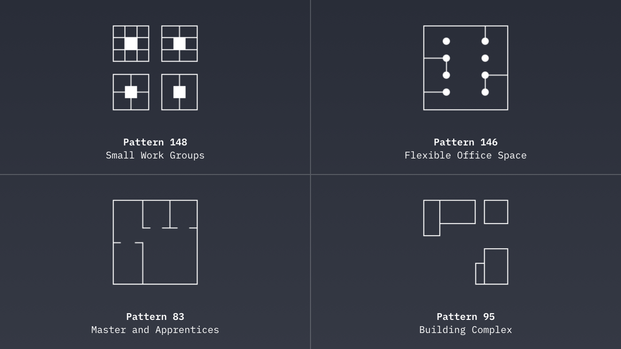
‘A Pattern Language’ was influenced by emergent thinking around computer programming and design. Alexander writes: “A pattern language has the structure of a network.” Echoing networks, and the connections that exist between nodes on the network, each pattern cross-references others.
The result is a book that is structured in a similar manner to hypertext, where each pattern links to other, related patterns. For example, the description of Pattern 148 ‘Small Work Groups’ references Pattern 83, ‘Master and Apprentices’, which – in turn – references other patterns (Patterns 152 and 183).
When you consider that Alexander’s book was published in 1977 – a decade and a half before the birth of the web – it’s clear that the book was far ahead of its time. Indeed, Alexander’s book would lend itself well to a new, web-based edition that takes advantage of the extensive cross-referencing that he built into the book.
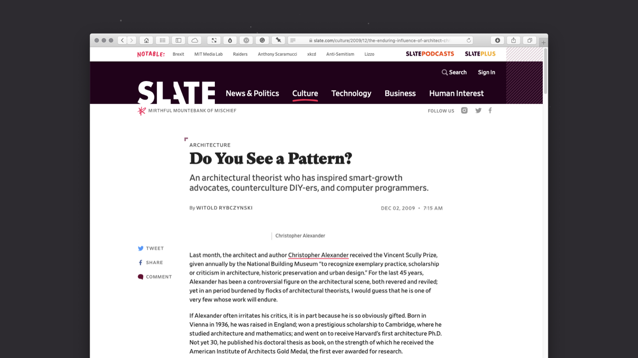
Slate highlights the widespread impact of ‘A Pattern Language’ in an excellent article from 2009, titled ‘Do You See a Pattern?’, which explores Alexander’s enduring influence:
Alexander’s ideas have taken root in unexpected places. His early books, especially ‘Notes on the Synthesis of Form’ and ‘A Pattern Language’, influenced computer scientists, who found useful parallels between building design and software design.
If you read Alexander’s book – and it’s by no means a brisk read at 1,171 pages – the parallels between his methodology and that of user interface pattern libraries, like Pattern Tap and UI Patterns, become clear.
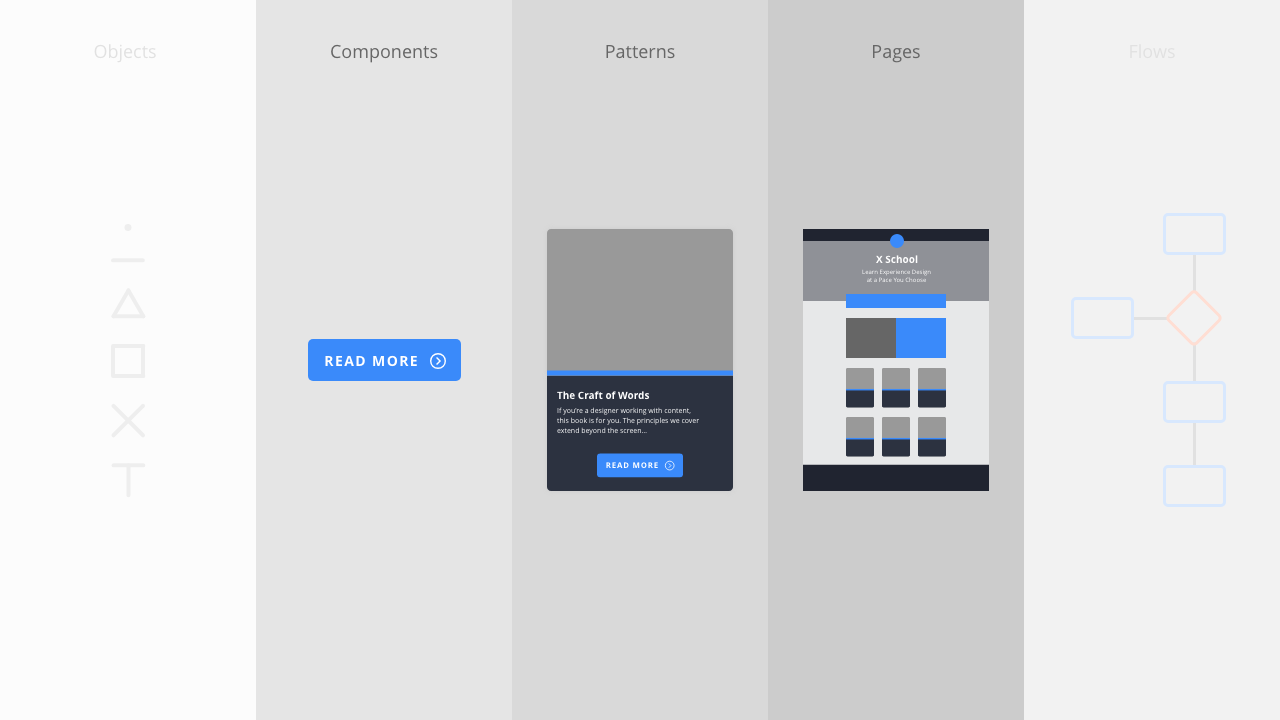
The methodology I explored in Chapter 2 – Objects, Components, Patterns, Pages and Flows – where we use simple things to build complicated things is not unlike Alexander’s methodology. The only difference is that Alexander’s sequencing, designed to meet the needs of architecture, moves from the large to the small:
When we use the network of a language, we always use it as a sequence, going through the patterns, moving always from the larger patterns to the smaller, always from the ones which create structures, to the ones which then embellish those structures, and then to those which embellish the embellishments.
We could imagine similar words being used to describe the design of pages, which have to function at a practical level, but which can be embellished at a pattern and component level.
Hopefully, as you read this, you’ll understand the parallel.
Alexander has created an index of patterns which designers (architects) can combine, like the words of a language, to build whatever they desire. Replace ‘building’ (house) with ‘digital product’ (website or application) and a great deal of Alexander’s thinking maps over.
* Although ‘A Pattern Language’ is widely credited to Christopher Alexander (as the lead author of the book) it was actually co-authored by Sara Ishikawa and Murray Silverstein, with the assistance of Max Jacobson, Ingrid Fiksdahl-King and Shlomo Angel.
Many patterns form a language…
Just as Alexander created a book including 253 cross-referenced patterns, so too, we – as user interface designers – can create our own pattern libraries, gathering examples of user interface patterns that work.
Put simply: We can build our own libraries of patterns, similar to Matthew Smith’s work with Pattern Tap. These libraries will prove incredibly valuable over time as you encounter new problems and new challenges in your user interface design.
There is always downtime in a studio. You can use that time to let off steam and play table tennis or fussball, but you can also put that time to good use, by gathering examples of patterns ‘in the wild’ that you can return to when you embark upon new projects.
It’s a good idea to get into the habit of collecting examples of the different design patterns that you either:
- create for projects, or
- discover during your research.
These can be useful for showing clients or project partners, using them as examples of how typical design problems are addressed. (A series of credit card patterns if you’re developing a digital store, for example.)
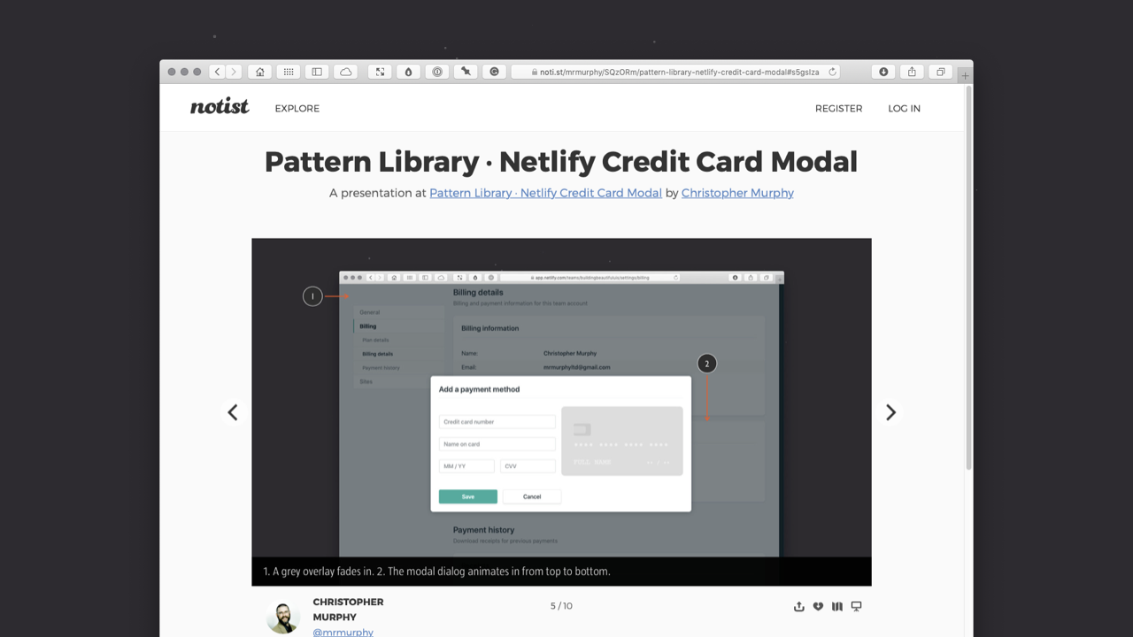
In my work, I keep collections of example patterns organised by folders. For each pattern, I create a new Keynote slidedeck and organise all of my screenshots accompanied by comments. Here’s an example, analysing Netlify’s Credit Card Modal Pattern.
By building a collection of design patterns and noting how and why they work, you can accelerate your design process considerably. Even better, through careful analysis of others’ work (as I recommended in Chapter 2) you can begin to ‘see through the eyes’ of other designers and begin to think like they think.
Before you build something, which is a time-consuming and expensive process, it helps to find relevant examples from your library, allowing you to visualise how aspects of your user interface might look.
When you build your pattern library, it’s important to establish some conventions that you follow. At the very least, each pattern entry should have:
- a clear name;
- an image;
- a descriptive entry; and
- cross-references to other related patterns.
Applying this to the above Netlify credit card modal dialog, this might be:
- Name: Netlify Credit Card Modal
- Image: Modal Screenshot
- Description: Netlify’s credit card modal is a lovely example of a delightful interaction pattern for entering credit card details. As you enter your card details on the left-hand side, the credit card updates, showing your card details on the right-hand side.
- Related Patterns: Here you might gather links to other payment forms you’ve designed for projects, or to others you’ve discovered in your research.
Every entry in your system is a single design pattern and each of your documented patterns should explain why that solution works well in the pattern’s contexts.
Using the objects and components, which I explored in Chapter 2, to create patterns that we organise on pages is where things get interesting. Essentially, we’re building a library of consistently designed elements – a design system – that we can combine in different ways to create the pages of our interfaces.
By starting from the object and working up towards components and patterns, we can build a consistent set of user interface elements that we can then further orchestrate within pages, as I’ll explore in the next section.
Section 2: Components → Patterns → Pages
Having explored the benefits of pattern languages, and provided some history about their origins, in this section I’ll dive deeper and explore some examples of patterns, demonstrating how they can work together as part of a greater whole.
The beauty of this approach, building from the object up, is that it allows us to establish a structure and hierarchy at every level of our design: Components → Patterns → Pages → Flows.
If we consider the structure and hierarchy of the patterns we build, when we subsequently put these patterns together to form pages, our overall structure and hierarchy falls more or less into place. In short, it’s important to consider the structure and hierarchy of our content at multiple levels as we design it.
As with the components I explored in Chapter 2, where components were built out of objects, patterns are – themselves – built out of objects and components, we’re simply increasing the complexity.
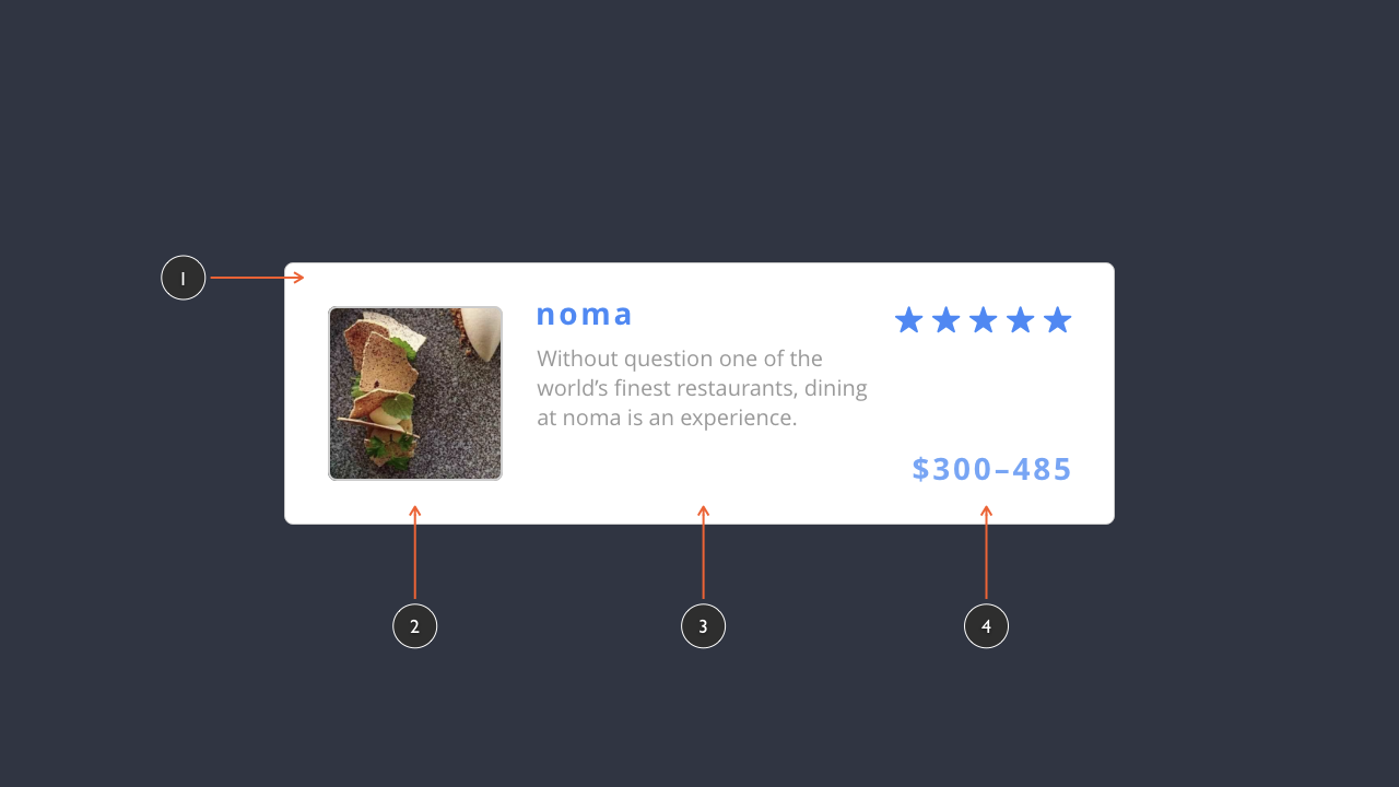
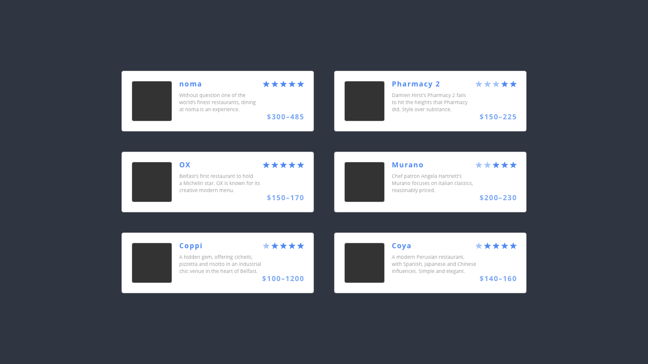
The restaurant listing pattern (above) is contained in a card (1), gathering together the information required:
- a preview image (2);
- an overview of the restaurant (3); and
- a star rating and a price guide (4).
Establishing a pattern for this content requires us to analyse the information supplied and consider its overall structure and hierarchy. For example, the overview of the restaurant – its name and the brief description (3) – are ordered logically with:
- a heading (noma), which is larger and in blue; and
- a brief description (“Without question…”), which is smaller and in a lighter grey.
The beauty of this approach is that this pattern can be re-used, for other restaurant listings, resulting in a more consistent interface that’s efficient to design. We might gather together a series of restaurant listings, for example, where we re-use the pattern to build out our interface (below), gathering a group of listings.
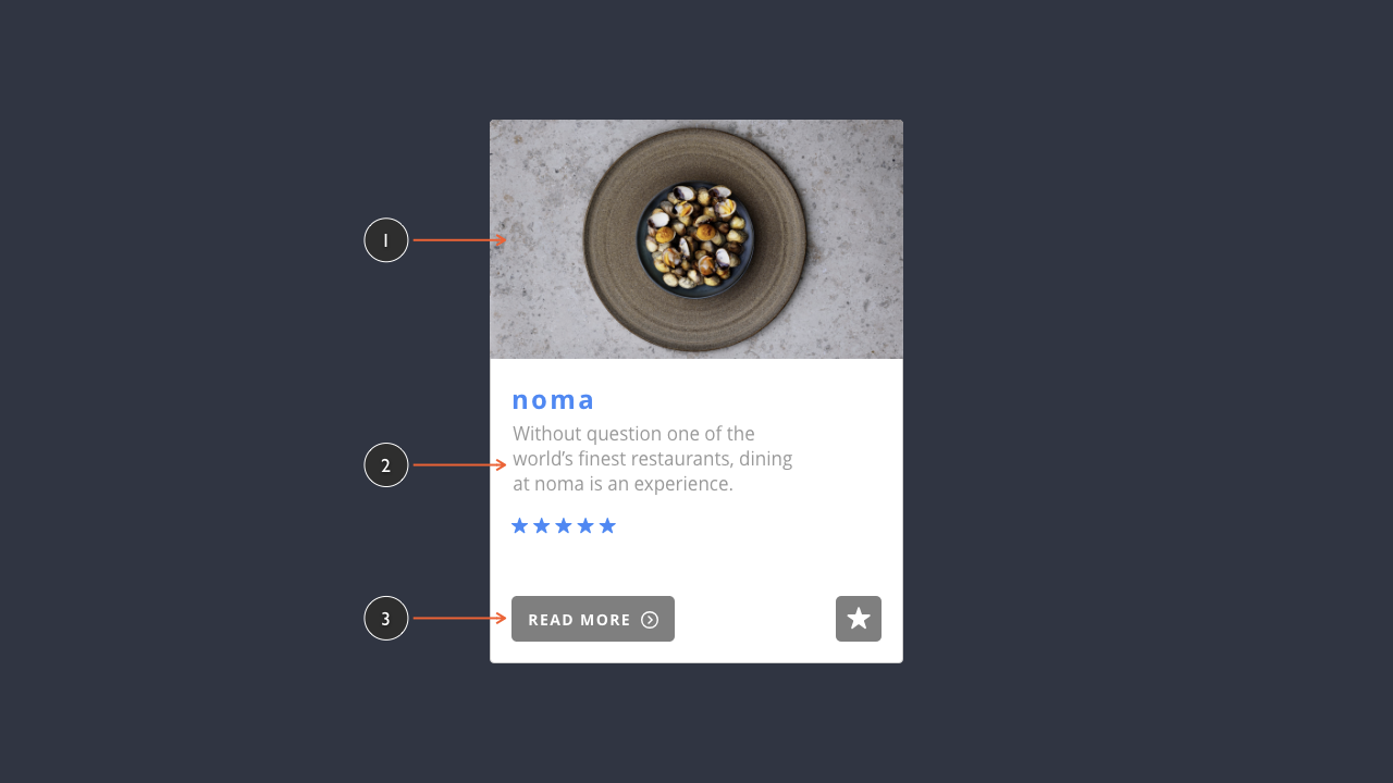
The pattern above is relatively simple. Should our design require a little more detail, we can use the same organising principles to create a more complex pattern (below). We’re simply levelling up the complexity once again.
Whilst this might look complicated at first glance, if we break the pattern down into its constituent parts we can see it’s relatively simple, comprising three content sub-sections:
- a section for rich media, in this case an image (1);
- a section for text, where our information is organised with titles and supporting text (2); and
- a section where we present actions (3).
We see these kinds of ‘content clusters’ in both desktop and mobile interfaces, where information needs to me structured into organised groupings. This pattern-driven approach is used, for example, in Apple’s Apple Trade In programme page (below).
Although the user is required to provide a great deal of information (including: their phone’s make and model, its serial number, and its condition) the information required is broken down into a series of easily understandable groupings.
The result is that users are taken step-by-step through everything they need to do, in a clearly considered user flow.
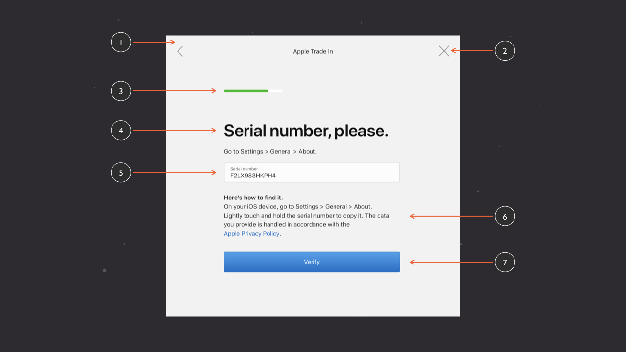
This example, from Apple, levels up the complexity further, drawing together a number of elements, including:
- a card, grouping everything (1);
- icons to return to the previous page or close the modal dialog (2);
- a progress indicator (3);
- a number of typographic elements (4, 6);
- a form field (5); and
- a call to action button (7).
This pattern, coupled with a clearly considered user flow (which I’ll explore in more detail in ‘Chapter 4: Getting From A → B’ (Coming soon, I hope!)), eases the process considerably.
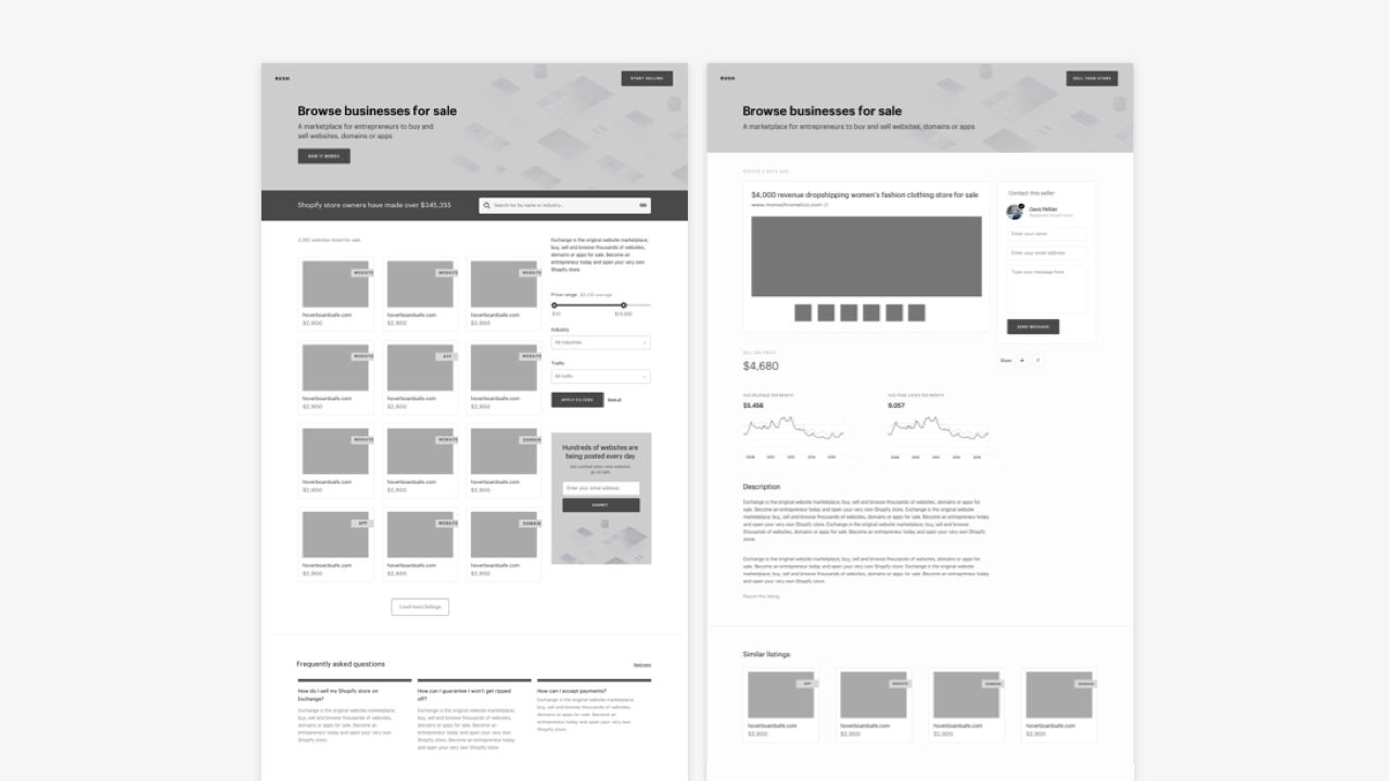
From Patterns to Pages
With some patterns explored, it’s time to explore how we can use patterns – fitting them together like the pieces of a jigsaw – to create pages.
Consider a typical page, like the Curated Galleries page at Behance (below). It’s organised at every level, featuring:
- an overall hierarchy and structure at the page level; and
- a specific hierarchy and structure at the pattern level.
At an overall page hierarchy, our eye is drawn to the title: Curated Galleries. Its size on the page and the weight of the type used catches our eye, signalling the page we’re on.
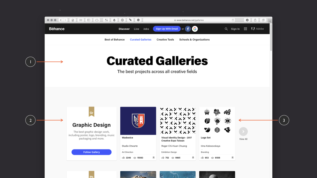
Continuing from the overall page hierarchy, our eye is drawn secondly to the row of thumbnails in the Graphic Design category, which follows a pattern that is repeated down the page that includes other categories: Photography, Illustration, Interaction….
At the category level, the eye is drawn to the title – Graphic Design – first, with its short overview paragraph (“The best graphic design…”), before being drawn to the ‘Follow Gallery’ call to action button, which – in blue – catches the eye, perfect for a call to action. The gold ‘Gr’ bookmark at the top is the least visually dominant element, satisfying a labelling function.
At the pattern level (below), there is an equally clear hierarchy and structure. The thumbnails provided satisfy the purpose of previewing visual content (a content pattern), which are in turn repeated on the page as a way of previewing content from within a category (a display pattern), which in this case focuses on the Graphic Design category.
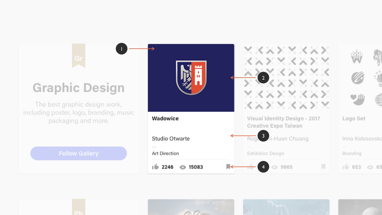
The ‘card’ pattern that’s used at Behance – carefully organised at the pattern level – is perfect for page level display.
As ‘information containers’ – self-contained units of content – cards can be used to organise a range of different objects and components, including: imagery or rich media (video, for example); text objects (which can also be hierarchically organised); and buttons.
One of the primary benefits of embracing cards is their adaptability. Cards can be reorganised or reflowed depending upon the screen real estate available:
- in a desktop context we might lay out our cards horizontally and vertically, in a grid; and
- in a mobile environment – on a tablet or a smartphone, where space is at a premium – we might vertically stack cards in a layout that users can scroll down.
The beauty of card patterns like this is that they’re perfect when it comes to design, especially responsive web design (RWD), because the cards can reflow at narrower viewport widths, whilst still retaining their pattern level structure and hierarchy.
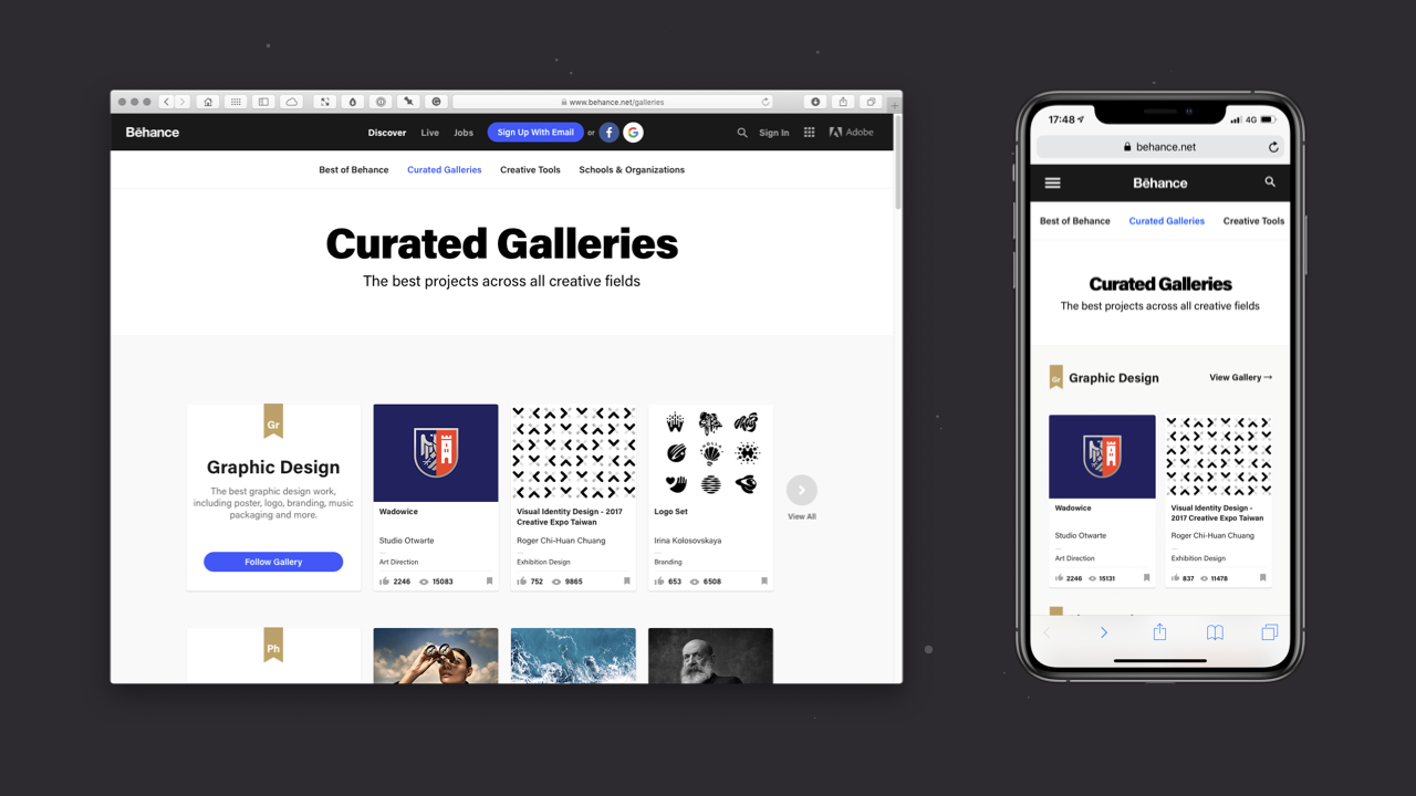
When we consider Behance’s desktop and mobile views (above), we can see the beauty of adopting a card pattern for the site’s thumbnail content:
- in a desktop context, where there is more horizontal space, the grid is allowed to use more horizontal space (on my external monitor, it displays six thumbnails); and
- in a mobile context, where there is less horizontal space, the grid is tighter (on my iPhone XS Max, it displays two thumbnails).
In both cases – desktop and mobile – the card pattern, regardless of the viewport width, retains its own internal hierarchy and structure.
Case Study: Dribbble
In this case study, I’ll tie together everything I’ve covered above and explore how the various elements comes together in a website – Dribbble – building complexity step-by-step, from the object up.
In particular, I’ll focus on how Dribbble uses cards, which – as I explored above – are useful for organising complex information.
As we’ll see, Dribbble’s pages – although on the surface relatively complicated – are comprised of a wide range of relatively simple elements including:
- Objects
- Components; and
- Patterns
By using Dribbble as a case study and analysing it, I’ll show how we can use the objects and components, that were the focus of Chapter 2, as the building blocks from which to build patterns and pages that are the focus of this chapter.
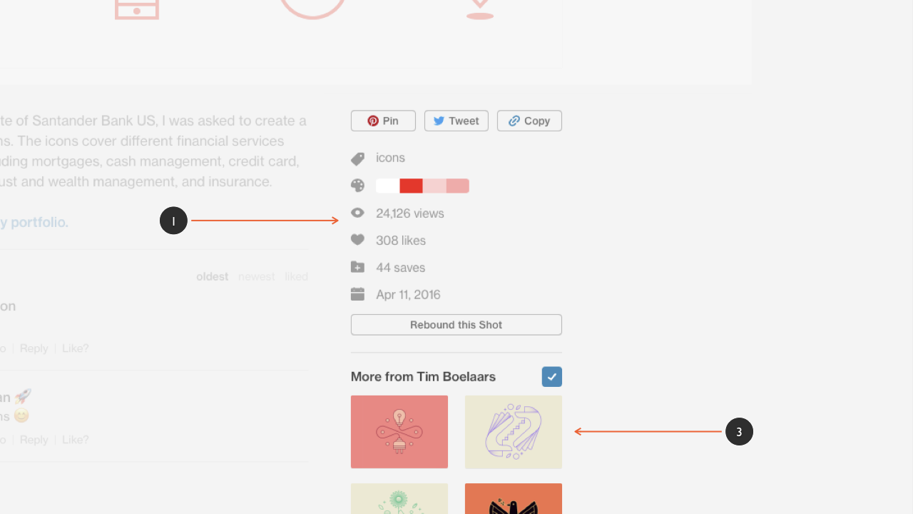
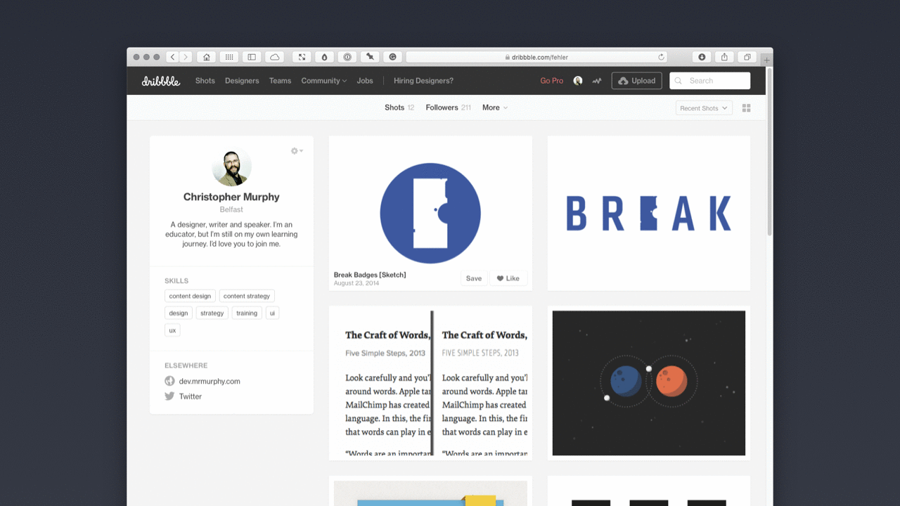
If we look at one of Dribbble’s profile pages (below), we can see that it’s built from a set of core building blocks: patterns that have been designed to satisfy a variety of particular purposes. These patterns include:
- a navigation pattern, at the top of the page (1);
- a profile pattern, on the left-hand side of the page (2); and
- a shot pattern that is used multiple times on the right-hand side of the page (3: in a non-active state, and 4: in an active state).
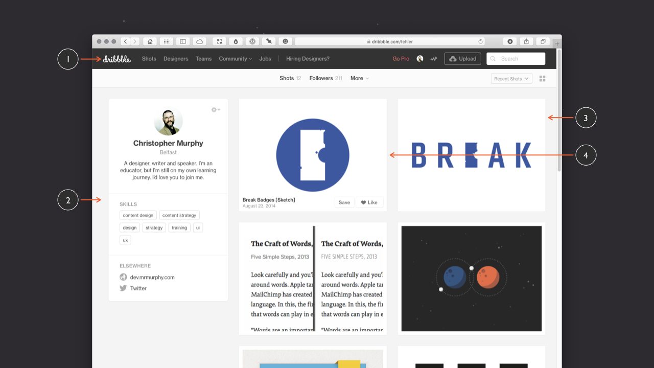
Each of these patterns has been designed to communicate different types of information and, when we look at each of these patterns in turn, we see that they each have their own logical structure.
This is an important point to note and it’s one that’s worth emphasising. We can – and should – consider structure and hierarchy at multiple levels, including the pattern- and the page-level. So, just as Dribbble’s profile page has a considered overall structure and hierarchy, so too do the different patterns on the pages.
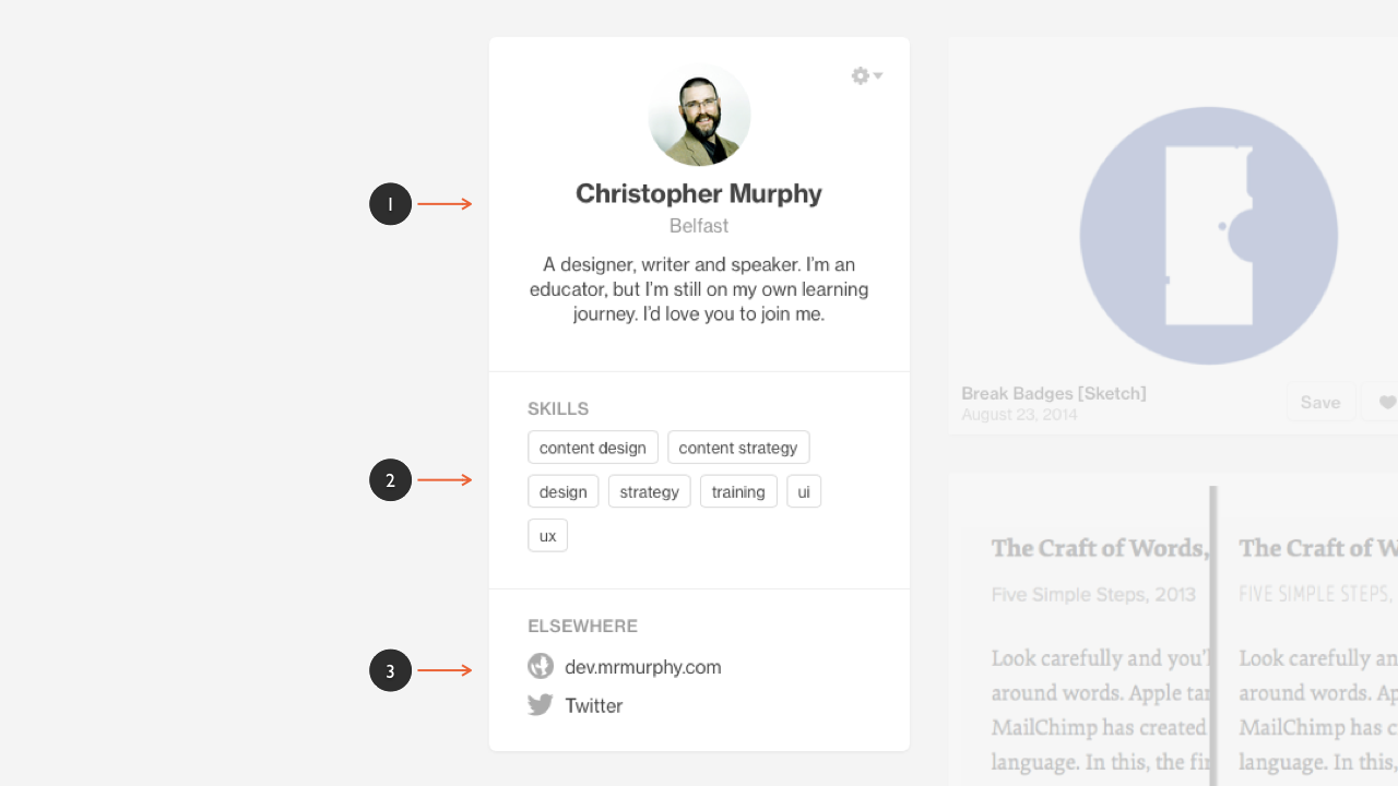
If we focus in one one of these patterns (above), the profile pattern communicates information about the user in question. This information is divided into three sub-sections or groupings of content: ‘profile’ (1), ‘skills’ (2) and ‘elsewhere’ (3). So – even at the pattern level – we can consider our content’s structure and hierarchy ensuring everything is logically organised.
Looking at the above profile pattern (my @fehler profile) we see the information is organised into three sections:
- Profile
- The User’s Name: Christopher Murphy
- The User’s Location: Belfast
- The User’s Biography: A designer, writer and speaker…
- Skills
- content design, content strategy, design…
- Elsewhere
- dev.mrmurphy.com
This pattern level structure and hierarchy groups related content – all about the user – into one, carefully organised space.
Dribbble wouldn’t be Dribbble without its ‘shots’ so it’s no surprise to see a great deal of care and attention (not to mention distillation and refinement over time) has gone into the design of the site’s ‘shot pattern’. Shots are, after all, the primary focus of Dribbble.
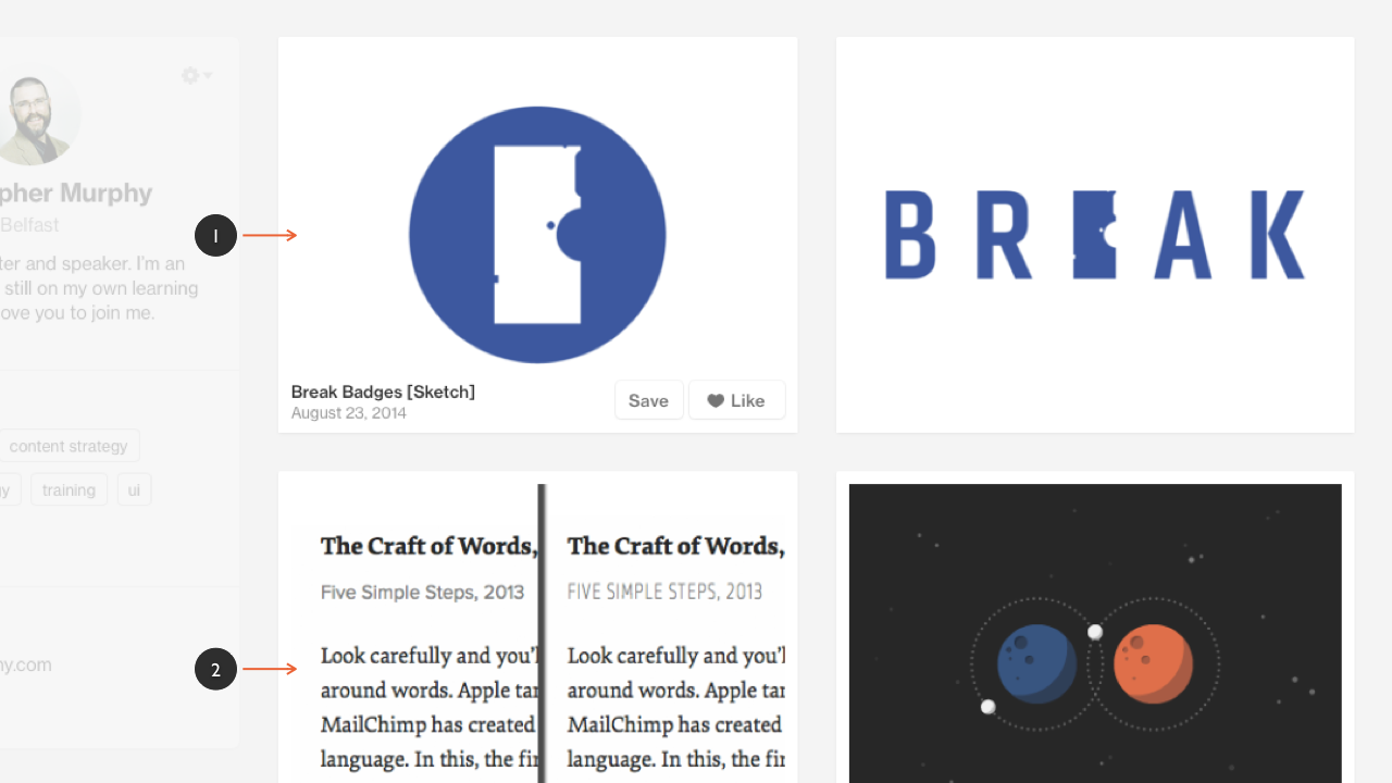
Dribbble’s shot pattern, like the profile pattern, has its own structure and hierarchy that communicates information about the shot in question:
- The Shot’s Title: Break Badges [Sketch]
- The Shot’s Upload Date: August 23, 2014
It also features ‘Save’ and ‘Like’ buttons (which are examples of components, as I explored in Chapter 2) so that users can interact with the shot:
- A Save Button: So users can add the shot to their buckets.
- A Like Button: To show your appreciation of the shot in question.
This shot pattern is used in a number of different locations throughout the Dribbble website, including:
The re-use of this pattern in so many different areas of Dribbble’s website underlines a further, important benefit of building patterns as a core part of your design process, namely: reusability and consistency.
The more you embrace reusability and the less you reinvent the wheel, the more consistent your user interfaces are and the quicker they are to build.
Patterns used this way are a little like variables in programming languages: make a change to a variable and that change cascades out, taking care of the bigger picture.
If we dive a little deeper and explore Dribbble’s shot pattern in more depth (below), we see that the pattern has a number of possible states:
- a non-hover state that showcases the shot alone (1);
- a hover state that reveals metadata about the shot (2);
- a hover state that highlights when a user has liked a shot (3) (the user might also have saved a shot and not liked it, but it’s unlikely); and
- a hover state that highlights when a user has liked a shot and saved it to one of their buckets (4).
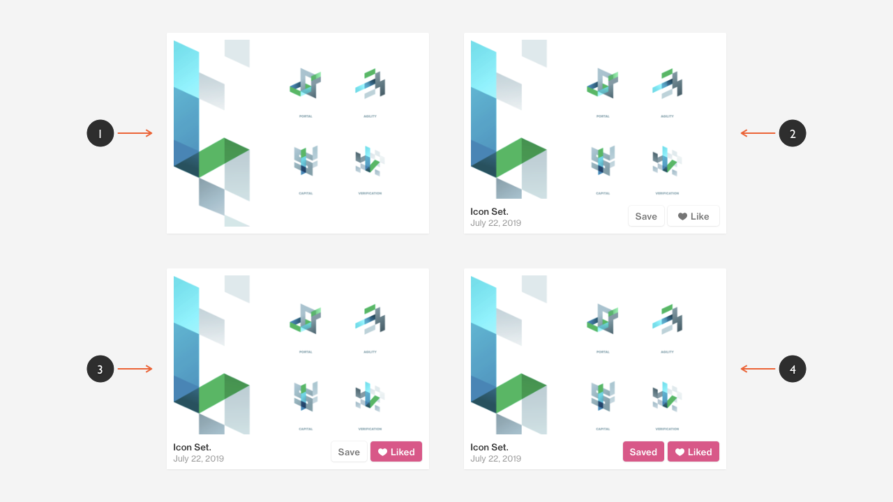
It should be obvious, after reading Chapter 2, that the Saved and Liked buttons are examples of button components used as a part of the pattern.
By embracing a pattern-driven approach, Dribbble can re-use these components and patterns elsewhere on the site.
On Dribbble’s Home page, for example, we see the shot pattern re-used multiple times to show the latest shots that have been uploaded. On the Teams page, we see the same pattern – reused at a smaller size – to showcase the work of different design teams using the service.
When we focus on featured shots on Dribbble (below) we see a different pattern, which presents more detailed information. From a functional perspective, clicking on a shot preview opens it in a modal dialog – a dialog, or window, that appears on top of the main window – focusing your attention on the shot in question and presenting it at a larger size.
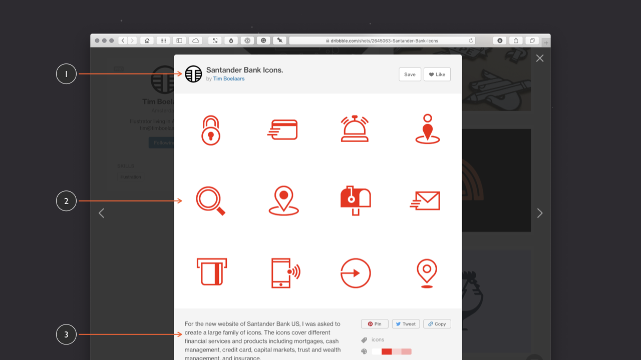
This pattern – which uses more of the viewport – allows the information to breathe a little more, thanks to the extra screen real estate used. It also provides:
- the shot details, including metadata on the left, and ‘Save’ and ‘Like’ buttons on the right (1);
- the shot itself at a larger size (2); and
- any additional details about the shot that the designer has provided (3).
Scrolling down the page (below) reveals additional information about the shot thanks to the use of a number of other patterns. These include:
- a description of the shot, with users’ responses beneath it;
- supplementary information about the shot (1) including: tags, the shot’s colour palette, the number of times the shot has been viewed, and other details; and
- links to other shots (2), by the designer in question.
Hopefully this case study has demonstrated the power of embracing user interface patterns as a core part of your user interface design strategy. By incorporating patterns built from objects and components into your user interface toolbox, you reap countless benefits, including:
- accelerating your design process;
- creating updatable patterns, streamlining the maintenance of your design over the long-term; and
- ensuring your interfaces are more consistent.
With our case study wrapped up, let’s explore some examples of patterns that you’ll encounter when you’re designing user interfaces.
Section 3: A Library of Patterns
In this section, which echoes the structure of Chapter 2, I’ll explore a series of typical user interface design patterns that you might encounter and will almost certainly need to design.
As with the previous chapter, this is not an exhaustive list, rather it’s intended to focus on a subset of common patterns that exist, highlighting the principle that patterns are useful in user interface design and need to be considered. There are many more design patterns available, as always, research is key.
I’ll explore the following patterns and, as with Chapter 2, I’ll provide a series of XD artboards that you can also explore further.
- Date Pickers
- Sign Up / Sign In Forms
- Credit Card Forms
- Notifications
- Activity Feeds
As I’ve noted above, patterns are incredibly useful and can save you a considerable amount of time when you’re designing a user interface. There’s little point in reinventing the wheel, if a pattern exists, embracing it – and modifying it if you need to – saves you from doing work that’s been done before by others.
With that point stressed, let’s explore some typical user interface patterns you may find useful.
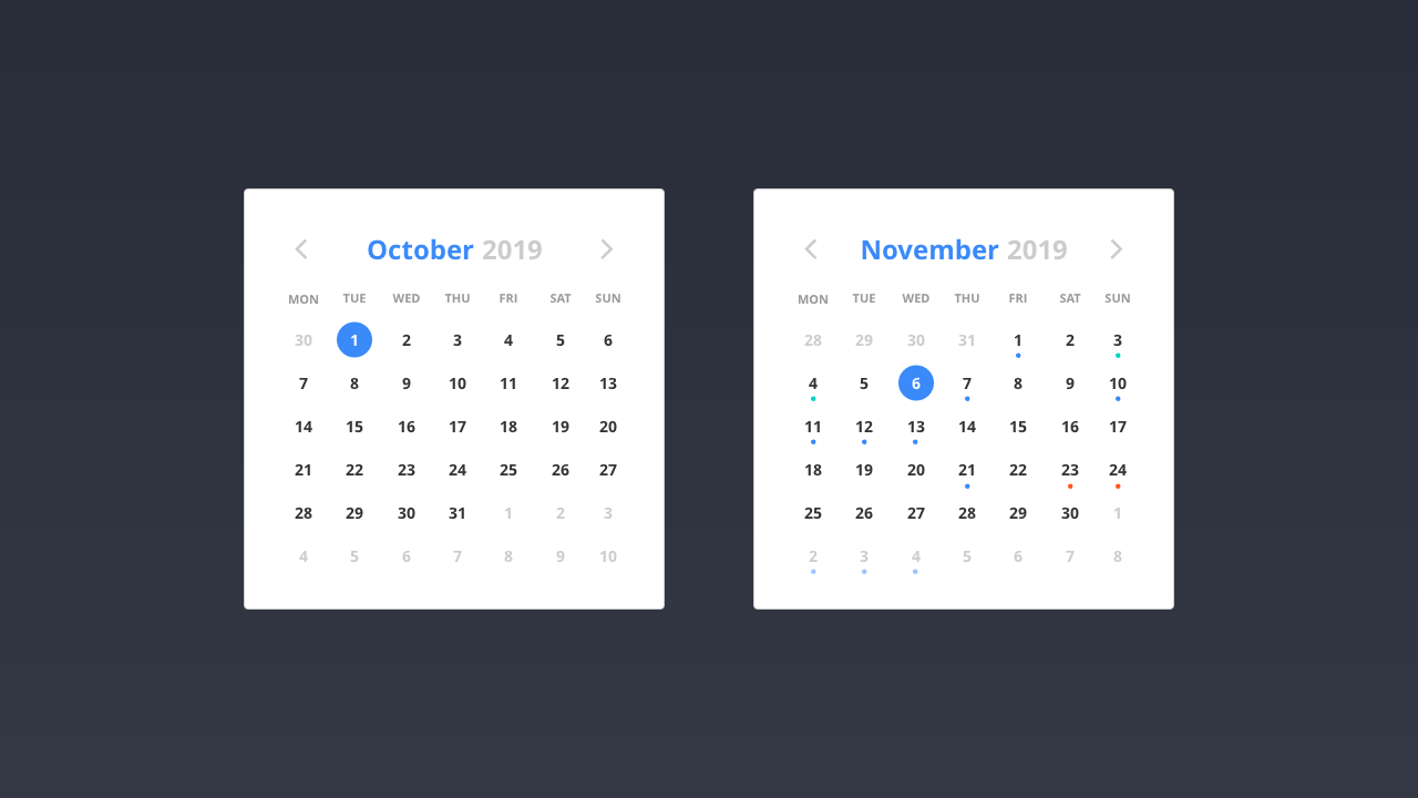
Date Pickers
As user interface designers we frequently encounter a need for date picker patterns. A user might, for example, need to:
- book a flight;
- add a reminder to a calendar; or
- make an appointment.
All of these interactions require a date – or a span of dates – to be selected. At the simplest level, a date picker pattern will include a calendar of some description, allowing the user to select the date or dates they require. At a more complex level, we might need to consider the inclusion of times in the user’s selection.
As I’ve stressed throughout this book, users have mental models of how these interactions function, based on their past experience. Rather than try to reinvent the wheel, it makes sense to explore what has already been tried and tested and proven to work.
Regardless of your requirements, you’ll almost certainly need to consider:
- displaying the current day’s date in a clear and obvious manner;
- how users move between different months and years; and
- managing error states (for example, if a user enters a return date that’s before the departure date).
Searching on Dribbble for ‘date picker’ returns a wealth of different solutions and visual approaches for date pickers. Harpal Singh’s, in particular, is worth looking at for the consideration he gives to different base, hover and error states.
Finally, Vitaly Friedman – Smashing Magazine’s founder – has written an exhaustive and very in-depth overview of date pickers, Designing the Perfect Date and Time Picker. A 40 minute read, it’s well worth setting aside some time to work your way through. Never one for half measures, Friedman considers every eventuality.
In the wild, Google Flights’ date picker is a great example of a date picker that’s beautifully designed, intuitive and easy to use. As I did with the Netlify Credit Card Modal (highlighted above), I’ve included an analysis of it in my pattern library.
What’s particularly nice about Google’s approach to its date picker pattern is its relative ease of use. Despite the complexity of the information it presents, the user interface is clear, grouped into a series of easily understandable steps.
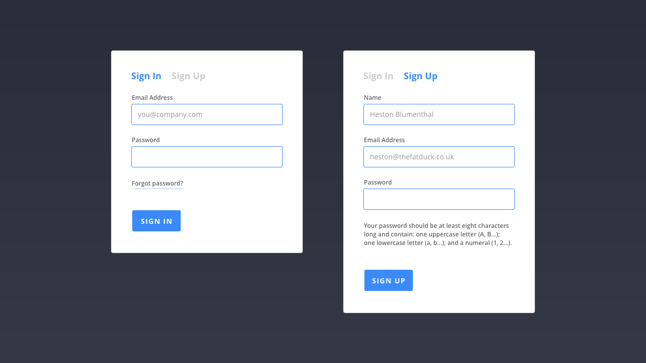
Sign Up / Sign In Forms
If you’re designing a piece of software (especially a piece of web-based software) or building some form of community-focused service where users will have an account, you’ll need to consider Sign Up / Sign In forms for users to sign up for your product or service, or sign into it.
When a user first encounters a SaaS (Software as a Service) product, they’ll often be asked to register for an account. This allows information relevant to the user to be stored for their return, or items added to a shopping cart to be saved for later.
This will often involve a round trip to an email client for your users to confirm they are who they say they are (something you’ll also need to consider).
Once a user has registered, they’ll need to sign in to access their account. If signing in is important to the application you’re building, it’s essential to ensure that the sign in form is clearly signposted.
Sign Up and Sign In forms at the very least require two pieces of data:
- a username; and
- a password.
Some forms ask for more information, but as a rule of thumb it’s best to keep your forms as short as possible.
If your goal is for users to sign up for an account, you want to remove as much friction as possible and removing form fields is a good way to do this. As a user becomes more embedded, using your application more frequently, you can ask for additional information you might need.
In addition to the design of the core sign up and sign in forms, there’s a need to consider what happens should users forget their registration details.
There’s nothing more frustrating than an application that doesn’t allow you to recover (or reset) your password should you have forgotten or lost it.
It might be tempting to kill two birds with one stone and present users with both the sign up and sign in forms side-by-side. This often leads to confusion, however, where a user tries to register by using the sign in form (or vice-versa).
A better approach is to present the user with one form, with a clearly signposted link to the other form. In the above example, clicking on the greyed out option takes the user to the form they’re not currently on, enabling them to switch easily.
I’ve focused on sign in forms because doing so enables me to explore forms (about which entire books have been written!), but do it in a more focused way without getting lost in detail.
If the user interface you’re designing includes forms – and it’s highly likely it will – I’d strongly recommend Adam Silver’s Form Design Patterns. It’s comprehensive and – like all books published by my friends at Smashing Magazine – it’s beautifully designed and printed.
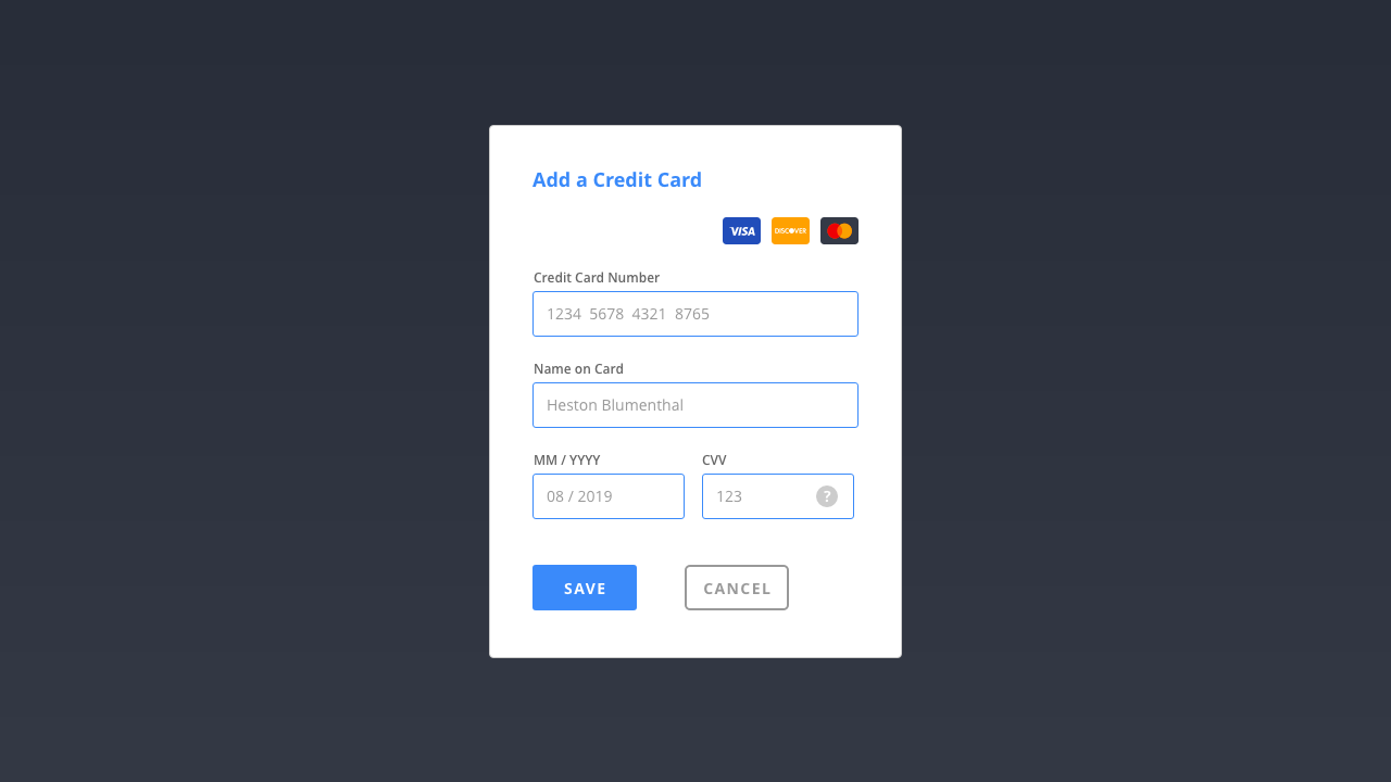
Credit Card Forms
The web has proven a powerful platform for digital commerce and, as such, credit card patterns – which structure the input of users’ credit card details – are in plentiful supply.
One of the wonderful aspects of working on the web is its leanings towards openness. Thanks to the web’s beginnings, in particular its ‘View Source’ culture, we’ve inherited a culture of collective understanding where talented individuals share their thinking for the benefit of all.
UX Collective, which gathers ‘curated stories on user experience, usability and product design’, offers a wealth of information on the design of all things UX +/ UI, and Gabriel Tomescu’s ‘Anatomy of a Credit Card Form’ takes the ubiquitous credit card form we meet, day-in day-out, and presents an exhaustive analysis of credit card patterns. It’s required reading should your project require payments of any kind.
When designing a credit card pattern, you should include the following:
- An indication of what cards are accepted.
- The name on the card.
- A card number (which you can dynamically format, with spaces between four digit groups, to help the user).
- The card’s expiry date.
- The card’s security, or CVV, code.
In addition to the above, it’s also helpful to indicate the type of card the user is using, so they feel re-assured that they’ve entered the correct details. It’s possible to determine the type of card being used by the number the card starts with, as follows:
- 3: American Express, Diners Club…
- 4: Visa
- 5: MasterCard
- 6: Discover Card
As I noted in my analysis of Netlify’s Credit Card Modal Pattern, Netlify uses this approach to change the design of the card on the fly to show the user a Visa or MasterCard, for example.
When money is changing hands, it’s important to establish a bond of trust, indicating to the users that their card details are safe and secure. UI Patterns has a helpful article on Designing for Trust that’s worth reading so you can put your users’ minds at ease.
Designing credit card patterns is – as you can see from this section (which is condensed) – a complicated process. In addition to the above, you’ll need to consider providing feedback when users enter numbers incorrectly, as they often do.
Ideally error checking can be handled on the client side (before submitting the form to the server) using formulae like the Luhn algorithm, which can highlight issues before the user submits their payment. Put simply, it’s complicated (but when you get lost down the rabbit hole of the Luhn algorithm, it’s also fascinating!).
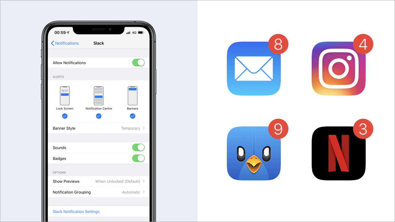
Notifications
Notifications are useful to alert users and draw their attention to important updates or messages.
Notifications can appear in a number of ways:
- at the system level; and
- at the application level.
System level notifications offer a number of benefits, not least because they’re persistent at the top level of the interface, i.e. your users can be made aware of notifications when the application you’re building isn’t open.
Most operating systems will allow you to tie into system level notifications using SDKs (Software Development Kits) or APIs (Application Programming Interfaces). SDKs and APIs are beyond the scope of this book, but it’s worth bearing in mind that notifications are available at the system level, should you need them.
It’s also worth noting that the design of system level notifications are to a large degree beyond your control as a designer.
Just because you can present your users with notifications doesn’t mean you necessarily should. Notifications can, if you’re not careful, prove irritating, annoying users about often trivial matters. Use them sparingly.
It’s important to consider, what I call, ‘levels of discretion’ for notifications:
- some are discrete, subtly sliding in and sliding out, catching the user’s eye and needing no further action (like a well-trained butler);
- others are a little more persistent, requiring action, signalling a higher level of priority.
Google’s Material Design guidelines provides an overview of a variety of different notification patterns (and their levels of priority), including:
- Snackbars: Temporary notifications that provide brief messages about app processes at the bottom of the screen. (Low Priority)
- Banners: Persistent notifications (that need to be dismissed) that provide actions for users to address. (Medium Priority)
- Dialogs: Notifications that appear on top of app content, providing critical information. On appearing, dialogs disable all app functionality and remain on screen until a required action has been taken, or they have been confirmed of dismissed. (High Priority)
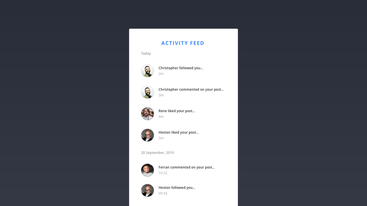
Activity Feeds
Activity feeds are ideal for displaying dynamic information that’s constantly changing. If you’ve used any form of social media – Twitter, Instagram, Facebook… – you’ll have used an activity feed.
At their heart, feeds are lists of items that can be organised and grouped by almost any parameter, for example:
- time
- popularity
- frequency
- relevance
- …
Feeds can be simple, like those used in social media timelines, or they can be used to handle more complex information like upcoming flight departure times at an airport.
Feeds allow users to personalised their user experience, allowing users to connect with others, for example, or follow specific topics that they are interested in.
Stream, a provider of scalable feed APIs, has created an in-depth overview of feeds – The Ultimate Guide to Activity Feed Design – which is well worth bookmarking and reading should you need to consider the design of activity feeds in a user interface.
Section 4: Information Architecture
In an age of information overload, establishing a clear information architecture – so that we ensure our users can find their way to what they’re looking for – is more critical than ever.
Given that this chapter is titled ‘Information Architecture’, I think it’s important I explain what that means. Essentially, information architecture focuses on organising, structuring and labelling information so we can improve its findability and discoverability.
The information architecture of websites and applications is critical. If it’s done well, it enables users to complete the tasks that they need to complete. Conversely, if it’s ill-considered, it leads to frustrated users who will very quickly find an alternative solution.
In The Difference Between Information Architecture and Navigation, Nielsen Norman Group argue:
Information architecture is not part of the on-screen user interface, rather information architecture informs [the] user interface. The information architecture is documented in spreadsheets and diagrams, not in wireframes, [mockups] or prototypes.
The reference to spreadsheets and diagrams should signal that we’re moving into different territory, beyond patterns and pages, to focus on the big picture and how everything fits together, conceptually. Nielsen Norman Group define information architecture as having two main components:
- identification and definition of site content and functionality; and
- the underlying organisation, structure and nomenclature that define the relationships between a site’s content and / or functionality.
Expanding upon this, Louis Rosenfeld and Peter Morville, in their book Information Architecture: For the Web and Beyond, identify four main components of information architecture:
- organisation systems;
- labelling systems;
- navigation systems; and
- searching systems.
As Morville, helpfully explains: “What architects do for buildings, information architects do for websites, applications and interactive services.”
The building analogy is a useful one. When you arrive at any new building, signage (the navigation system) usually points you in the right direction. This signage will prove more effective if it’s logically labelled (with a labelling system) and the layout of the building (its organisation system) has been carefully considered.
Whether we’re designing a website or an application, we need to put some thought into these systems. Do so and we’ll help our users.
Everything we design is created from content. When we design a user interface, we take this content and we organise it, enabling the user to navigate it and help them to quickly and easily find their way.
There are a number of approaches you can use to take the content you need to organise, and structure it. These include undertaking:
- content inventories;
- content audits;
- clustering exercises;
- taxonomy development; and
- metadata identification.
Content inventories involve examining a website or an application’s existing (or proposed) content to locate and identify existing content. If you’re working on a new project, it’s helpful to undertake some competitor benchmarking, exploring your competitors’ content and learning from it, to inform your own content creation.
A content audit involves evaluating the content you’ve identified during your content inventory exercise. At this stage, you’re focused on appraising the usefulness, accuracy and effectiveness of the content. It also helps to look at the content’s voice and tone and consider how content is used to communicate from a brand perspective.
Clustering exercises involve identifying clusters of content that sit well together in logical groupings. One way to do this is to undertake a card sorting exercise, exploring how users group information informed by their existing mental models. This can be helpful for establishing labelling systems.
Taxonomy exercises involve defining a set of standardised naming conventions for the content you’ve clustered. Again, it helps to undertake some research with users to establish how they approach naming content clusters. Unless you’re designing for a specialist audience, it’s best to aim for clear, concise and easy to understand language.
Lastly, it’s important to define useful metadata that can help you establish connections between different content clusters. This can be used to collect lists of related resources and develop other useful navigation elements.
As we design, we need to consider the information architecture, structure and hierarchy of the content we’re organising and apply it to our patterns, pages and flows, considering it at each level:
- patterns will have their own structure and hierarchy (as I’ve explored above);
- pages will have their own micro-level information architecture (as I’ll explore shortly); and
- flows, where we organise pages into content the user will see sequentially, will have a macro-level information architecture that takes into account the overall structure.
I’ll explore flows in Chapter 4: Getting From A → B – in this chapter, I’m focusing on patterns and pages – but the overall emphasis remains the same: We need to ensure everything is clearly signposted.
Finding the ice cream…
Donna Spencer’s excellent book – A Practical Guide to Information Architecture, for Five Simple Steps – used the analogy of finding sweets in a supermarket to explain information architecture at a high level. It was one of the most helpful explanations I’ve read, so I’m going to borrow it and put my own spin on it.
Spencer’s book – whilst sadly no longer available in print – is, as its title suggests, a practical guide to information architecture. It might no longer be available in print, but there is a Kindle edition, and I’d strongly recommend buying a copy because it provides a thorough overview of the principles of managing and orchestrating content, written in a clear and easy to read manner.
Whilst I’m partial to sweets (perhaps a little too partial) my real love is ice cream.

When I’m looking for ice cream in my local Co-Op, I know exactly where to find it. That’s a sign that I buy a little too much Ben & Jerry’s for my own good, but it also underlines how well-organised the Co-Op is. Everything is easy to find, enabling me to complete my (rather unhealthy) task easily.
Imagine I popped by my Co-Op on a Monday evening after work, however, only to discover it had been overhauled and refitted over the weekend. The entire supermarket layout was new and everything was in a different place.
How would I find the ice cream?
The good news is that, in a supermarket, everything is organised logically and grouped in a way that echoes my mental model. As I enter the Co-Op, I see that fresh fruit and vegetables are now organised immediately to the right of me. If I’m looking for fresh goods, I can find them all gathered together in this section. But where’s the ice cream?
Ice cream is sweet, so it might be organised with the sweets (bars of chocolate and other items of confectionary), but it’s frozen so I’d expect it to be organised with other frozen goods in the frozen section. Sure enough, when I find the frozen section at the back of the Co-Op, there’s the ice cream and I’m all set to add some Karamel Sutra Core to my basket. I’m a happy customer!
Put simply, information architecture is all about:
- organising content or objects;
- describing it clearly; and
- providing clearly defined pathways for users to get to it.
The above is true of: the page in relation to other pages, the page itself and parts of a page. It’s essential that we ground everything that we design, no matter how simple or complex, with the principle of helping our users ‘find their way’.
We see this principle followed on the web and in native applications. By grouping everything together logically, designers make it easier to find what users are looking for.
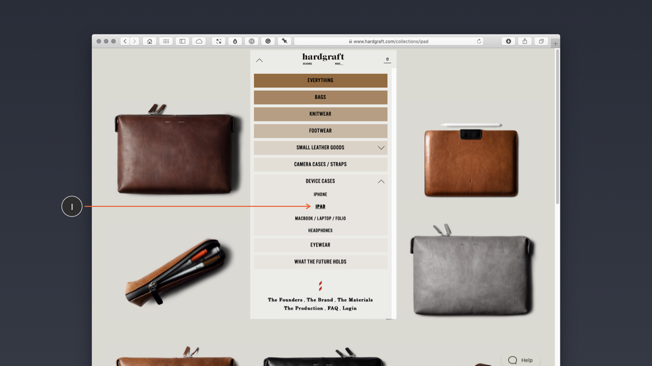
If I’m looking for an iPad case on the Hard Graft website (above), I can find them because they’re organised in an iPad section, under Device Cases:
Hard Graft > Device Cases > iPad
Amazon adopts the same approach. When you’re looking for something in The Everything Store, that lists almost all the items you could ever imagine buying, organisation is critical. Yes, most interactions on Amazon are driven by search, but that doesn’t mean its items aren’t also categorised.
At a high level, Amazon (below) organises everything logically under a ‘Shop by Category’ heading available in the sidebar accessed via a hamburger menu icon. I strongly suspect a combination of looking at user data (what are users looking for most?) and cold, hard business decisions (how can we promote Amazon’s products first?) is why this menu is organised and ordered the way it is.
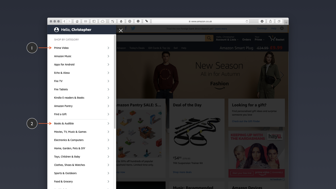
After a sub-grouping of Amazon’s own products (Prime Video, Amazon Music, Echo & Alexa…) there’s a further sub-grouping listing everything else, organised into logical groupings:
- Books & Audible
- Movies, TV, Music & Games
- Electronics & Computers
- …
As I noted above, the order of this list is probably driven by search data (of which Amazon has vast quantities). I suspect books are listed first, because they are still the most searched for item.
This point is worth underlining. When you’re designing a new digital product, you probably won’t have much data to draw from, so your decisions about how to organise everything will probably be drawn from a combination of user research (focus groups, perhaps) and instinct. If you’re undertaking a redesign, however, it’s worth looking at existing data and identifying what’s important to most users.
Again, how you organise everything and impose an overall information architecture will be driven by mental models. If users are looking for a portable power bank they expect it to be organised somewhere in the Electronics & Computers category, not in the Books & Audible category.
The bottom line: As you design your user interface, put some thought into how users find the ice cream (metaphorically, of course). Do that and they’ll thank you.
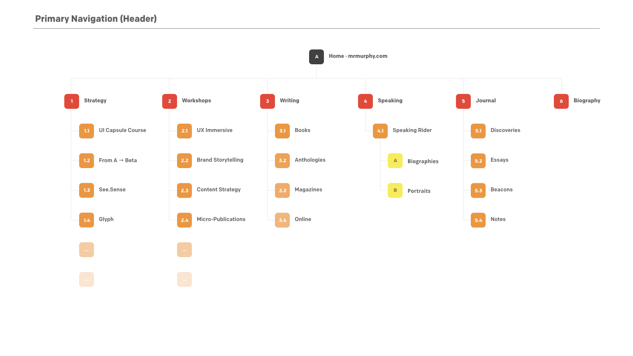
Site- and Page-Level Navigation
Information architecture applies at a range of levels, at both the site-level and the page-level (especially when pages are complicated with a lot of information). When designing a user interface, we need to consider the information architecture at:
- the application- or site-level, considering macro-level information architecture and site-wide navigation; and
- the page-level, especially when pages are information dense, considering micro-level information architecture and on-page navigation.
When you have a lot of information at the page level, there are a number of different approaches to presenting it:
- You might present it as one long page, which might be tempting, but the danger of this approach is that users can suffer from ‘intake fatigue’, where the volume of information overwhelms them.
- Alternatively, a better approach is to consider the page at an information architecture micro-level, where content is divided into logical groupings, which can be used to create page-level navigation. This gives users direct access to sub-topics of interest, it also provides users with a better understanding of how the overall content is organised.
The second of these approaches gives users a better chance of making their way through the content provided without being overwhelmed. By establishing a page-level structuring scheme as the foundation for a page-level navigation system, we give users a better chance of finding what they’re looking for.
As Peter Morville puts it:
The purpose of your information architecture is to help users understand where they are, what they’ve found, what’s around, and what to expect.
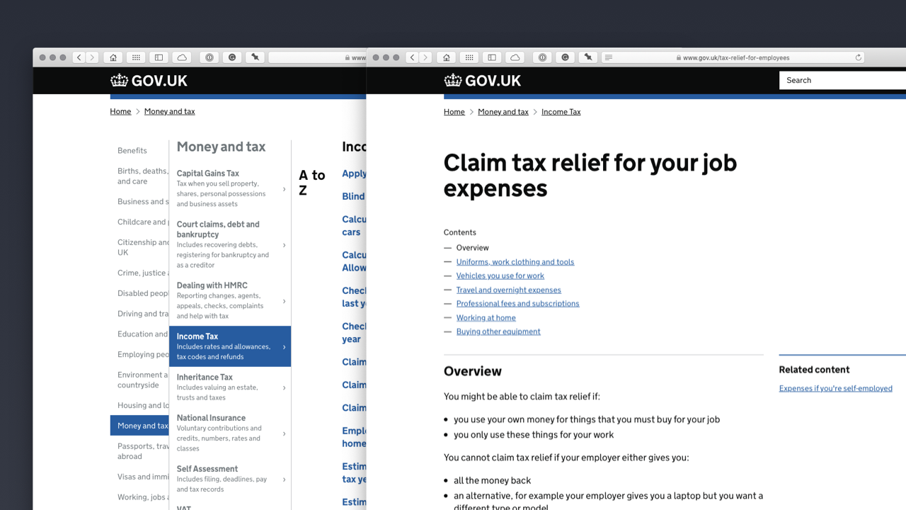
I touched on GOV.UK in Chapter 2, when I introduced design systems. GOV.UK (below) is a great example of a website with a clear information architecture, where a great deal of important information is ordered systematically.
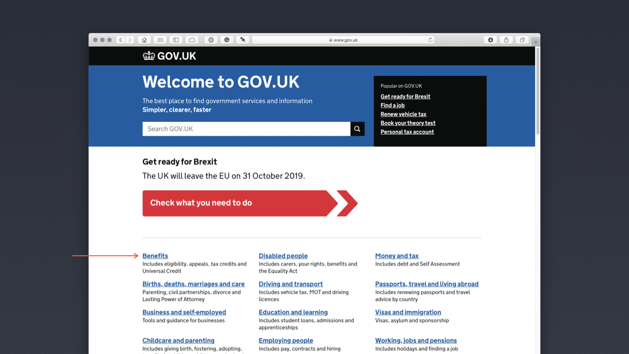
The overall information architecture is focused on the user’s needs and its clear, user-centred design is one of the many reasons that the site has won so many awards, not least a coveted D&AD Black Pencil (which are awarded only infrequently).
From an aesthetic point of view, the site might appear a little unadorned, but – in this context – what’s important is the way the information, of which there is a great deal, is organised and designed to help users.
The design might look simple, but it’s this seeming simplicity that lies at the heart of the design’s success. This focus on creating a user interface that is uncluttered and highly functional is encapsulated in GOV.UK’s Government Design Principles, specifically Principle 4:
- Do the hard work to make it simple.
This clear organisation permeates down to the page-level design, considering micro-level information architecture (below).
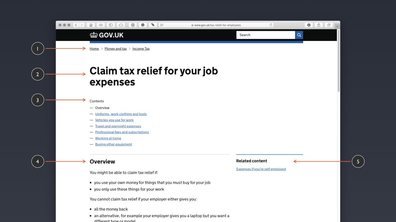
At a micro-level, GOV.UK’s pages are clearly organised with prominent, but understated branding at the top of the page. A breadcrumb trail underneath the branding (1) provides users with a clear sense of where the user is in the overall information architecture:
Home > Money and Tax > Income Tax
The interface is clearly focused on the ‘job to be done’, in this case finding out about how to claim tax relief for work-related expenses (2). A ‘Contents’ list at the top of the content (3) allows users to jump to the sections they’re looking for, quickly and easily. In the main content, an ‘Overview’ summarises the page content (4) and links to related content are provided (5).
At GOV.UK users have a clear mental model of the site that they’re using because the information architecture is clearly articulated through:
- the site’s simple, yet clearly organised structure;
- the use of breadcrumb navigation, which provides a clear sense of where a user is within the site; and
- the clear use of language, coupled with an uncluttered design.
It might be tempting to look at this design and imagine ways in which we could add to the interface – perhaps using animation or other ‘enhancements’ – but this would be missing the point, which is to start with user needs and enable users to satisfy these needs as quickly as possible.
With the theory of information architecture covered and some patterns and pages explored, its time to dive a little deeper into organising everything at the page level and identify some strategies for designing pages that communicate their content clearly.
Section 5: Moving From Low- to High-Fidelity
Before I kick off the final section of this chapter, it’s worth mentioning that in this section, I’m providing a comprehensive overview of a variety of different stages of a typical design process.
Every studio is different and many won’t use all of these processes, preferring one method over another. I think it’s worth highlighting all of these approaches, however, so that your understanding is well-rounded. With that note of caution sounded, let’s dive in.
In the final section of this chapter, I’ll explore the process of creating design deliverables at the page level, stressing the need to develop your user interface at a range of fidelities, including:
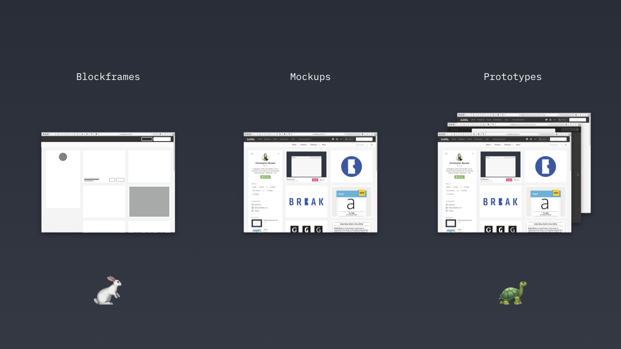
- low-fidelity deliverables (sketches, iconic layouts and blockframes) that are faster to create; and
- high-fidelity deliverables (wireframes, mockups and prototypes) that are slower to create.
Design is a process that ideally moves from low-fidelity to high-fidelity. Moving directly to high-fidelity mockups – with all the aesthetics pinned down (theoretically) – at the start of a project is incredibly inefficient. A better approach is to move through levels of fidelity, testing your thinking as you progress and increase fidelity.
The danger of starting with high-fidelity mockups is that you invest a great deal of time and energy creating deliverables that may not work at a practical and functional level. In studios, no matter how large or small, time is money and time is valuable, and you can’t afford to waste it on poor process.
A far better approach is to start at the lower fidelity end of the spectrum where you can work quickly, getting the broad brushstrokes in place. With that done, and – ideally – some user testing undertaken (no matter how informal) and your thinking tested, move towards higher fidelity outcomes.
A typical design process will include the following stages:
- sketching thumbnails to capture initial ideas;
- creating low fidelity iconic layouts and blockframes to block out visual hierarchy;
- developing wireframes to map out flows and establish functionality;
- moving to high fidelity and designing mockups to establish an overall aesthetic; and
- building an immersive prototype, using a tool like XD. *
* Although I’m introducing prototypes in this section, so that I can map out the design process, I’ll focus on them in the following chapter, when I explore flows and getting from A → B.
At every stage of this process we’re increasing the fidelity and moving closer to a finished outcome.
At the first phase of the process – with some form of content inventory and audit undertaken – we’re focused on a bird’s eye view, at a high level. At this point we can begin to start mapping out our content, considering how best to organise it.
You might be tempted to fire up your software tool of choice at this point, but I’d strongly suggest an alternative approach and a better tool: Starting with paper.
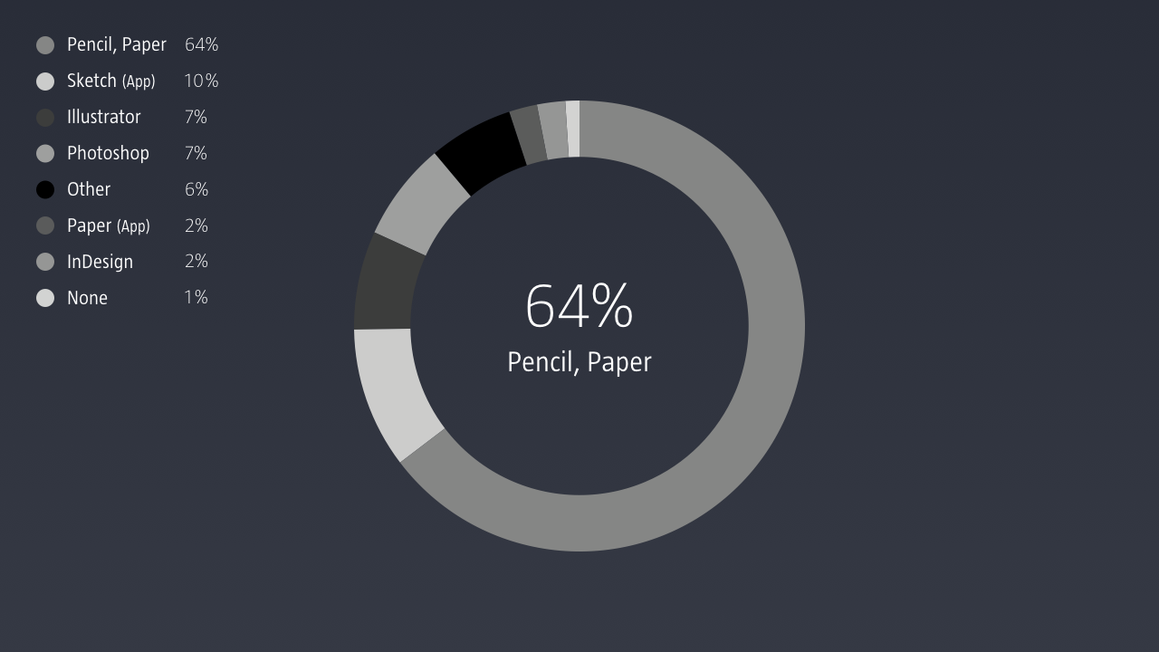
Although it’s a little old, Khoi Vinh’s 2015 Design Tools Survey revealed that, during the brainstorming phase, 64% of designers start with paper. Vinh described the results as follows:
In arguably the most important of the categories surveyed, participants voted overwhelmingly for the lowest fidelity tools: simple pencil and paper.
The landscape has, of course, moved on considerably since 2015, but I would argue – based on the many studios I work with and my own work as a UX +/ UI designer – that paper remains an essential design tool, and developing an ability to think through paper is critical.
When I work with students at Belfast School of Art, or professionals in my workshops, they often have one thing in common: They rush to start designing on a computer far, far too quickly.
That can be a costly mistake, leading to high-fidelity outcomes that suffer from fundamental functionality issues. A better approach is to start with paper to capture your thinking. Paper is a low-fidelity tool that’s stood the test of time and I’d strongly encourage you to develop your skills in this area.
Sketching interfaces isn’t about being a renaissance master, like Leonardo da Vinci, it’s about communicating your thinking in the most efficient way possible (above).
As Jason Santa Maria explains in his article Pretty Sketchy: “Sketchbooks are not about being a good artist, they’re about being a good thinker.” Jared Spool reiterates this point, stating: “The effectiveness of the communication matters more than the neatness of the artwork.”
I recommend limiting your palette to a handful of finepoint gel pens in different colours and some brush pens for adding highlights. For details, I recommend Pilot G-Tec-C4 Gel Microtip Rollerball Pens. For the broader brushstrokes, I swear by the Tombow ABT N75 Dual Brush Pen (which can elevate any drawing!). If you can afford a set of these, even better: Tombow have a set of six brush pens, which provides six blendable colours.
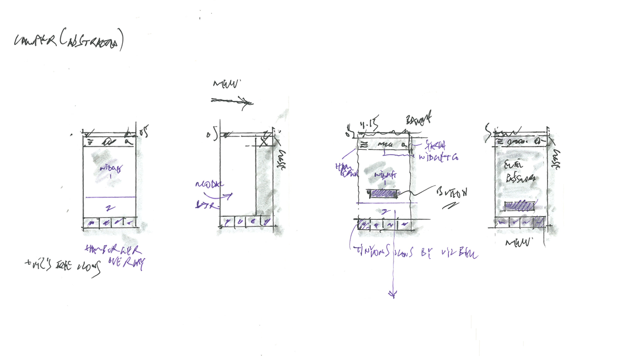
With our content mapped out – and some sketches developed – we can start to focus on getting everything organised at the page level, considering the overall structure and hierarchy of our pages by using iconic layouts and blockframes.
Iconic Layouts and Blockframes
With some thumbnails in hand, it’s time to move to the computer to start adding a little refinement to our deliverables, using: iconic layouts and blockframes. They’re a first pass on a computer, but at a low level of detail.
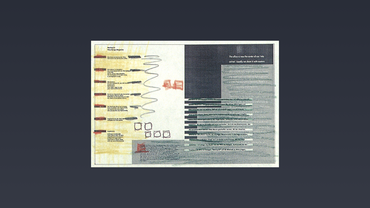
The idea for ‘iconic layouts’ is drawn from April Grieman’s 1990 book Hybrid Imagery: The Fusion of Technology and Graphic Design. The world has moved on a great deal since 1990, but one idea that Greiman embraced has stuck with me over three decades later.
Greiman referred to her initial digital sketches – for Workspirit Magazine, a publication for Swiss furniture manufacturer Vitra – as the ‘iconic’ first stage. As she put it:
A surprise in producing [the] initial miniature version was that I could see the whole magazine as a kind of ‘iconic texture’, free from detail.
By focusing on pages at an iconic level of abstraction – free from distracting details – Greiman was able to get a feel for the overall visual flow of the magazine while she was designing it.
As user interface designers, we might not be designing magazines, but we are designing sequences of pages, and I think we can learn from this methodology.
Although Greiman’s work on this particular project pre-dated the web, this approach reminded me of the kinds of low level iconic layouts I use in projects to map out visual hierarchy and flows at a high level before moving to wireframes and mockups.
I’ve used this approach ever since. By creating iconic layouts – very small layouts, focused on: relative scale, tone and, occasionally, colour – the hierarchy of pages can be grasped at a high level. This approach allows you to explore different layouts and get a feel for their overall visual hierarchy and structure.
These are micro-layouts – they’re at a level of fidelity that you can get a feel for the overall look and feel of a page – but they’re not so detailed that they absorb too much time, before you start to develop more refined mockups.
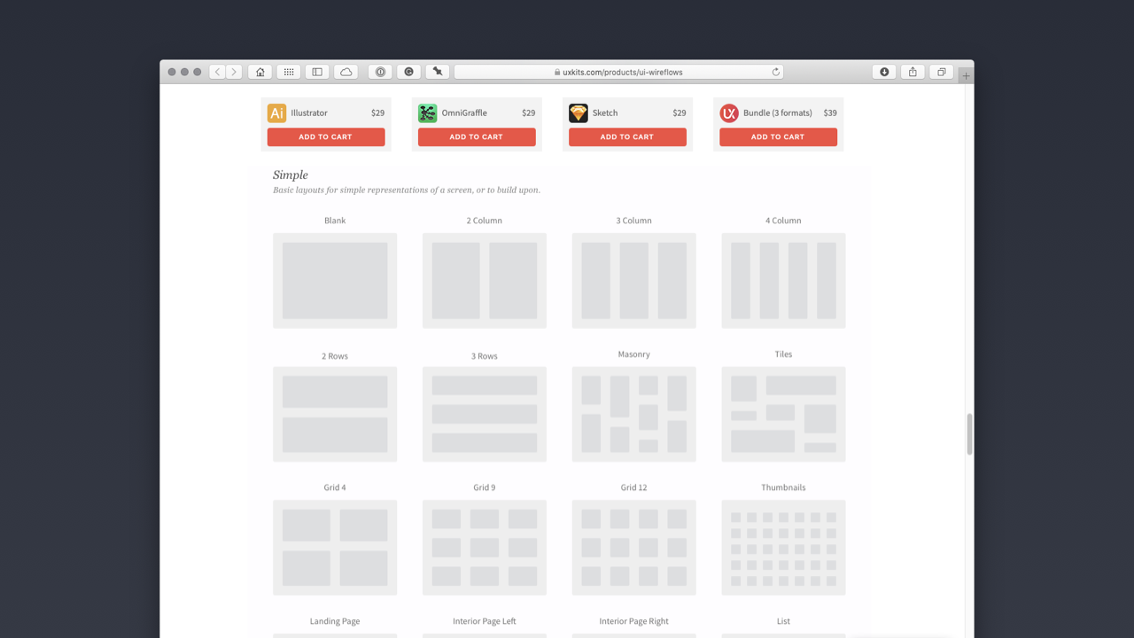
There are a number of UI Kits you can use to ensure this phase is more efficient (saving you redrawing everything). UX Kits, for example, have a UI Wireflows Kit that saves you having to redraw iconic page layouts. $29–39 is a small price to pay for the time it will save you redrawing these different assets.
If you’re learning, however, I’d suggest recreating these kinds of deliverables yourself. Doing so will develop your user interface drawing skills.
Although they might look visually similar, blockframes are slightly different to iconic layouts. Blockframes are low level representations of pages, with the detail dramatically reduced, which are especially useful when you’re revisiting the design of an existing product.
By reducing the detail you show with blockframes, you can save a great deal of time creating deliverables as you rethink aspects of pages or flows, when you’re revisiting a particular aspect of a website or application.
Jon Moore has written an excellent introduction to blockframes in a lengthy post on Medium with lots of examples. As Moore puts it:
Using a blockframe, [you can] describe entire areas of content instead of getting caught up in the details. This equips [you] with more than enough information to convey an idea or begin to tell a story.
By reducing the fidelity of your deliverables using blockframes (above), you can map out the elements of a revised interface quickly, safe in the knowledge that your client is already familiar with the overall look and feel of the interface.
Blockframes are also a useful deliverable when you’re considering how pages will reflow at different viewport sizes. With the essential details in place, you can quickly map out different viewport sizes at a block level.
Wireframes and Mockups
With the overall visual hierarchy of our pages blocked out, it’s time to level up the fidelity and build some wireframes and mockups and move closer to a finished outcome.
Wireframes are like skeletons, on which you later hang your visual aesthetics. They’re focused on the underlying structure and how everything fits together, at both a page level and, in flows, at a site level.
Unlike mockups – which provide visual details: typographic choices, colour palettes, data representations, imagery… – wireframes are design placeholders, indicating where elements are situated, without getting lost in detail.
Wireframes are important for getting the fundamental functional structure in place before visual design is integrated to create mockups at a higher level of fidelity.
Wireframes can also be used to test initial functionality, by linking them together in an immersive prototype, using a tool like XD. This can be useful to get a feel for how functionality works, before embarking upon more realistic prototypes using mockups.
When creating wireframes, it’s important to include annotations – guidelines for others involved in the design process – to ensure that your ideas are communicated clearly. Coupled with annotations, wireframes are useful for briefing other team members and, to a degree, clients and other stakeholders.
The highest fidelity we need to consider are mockups. These are highly detailed deliverables that marry our visual design with the layouts that we’ve created up to this point.
Mockups take the visual designer’s overall visual aesthetic and apply it to the creation of high-fidelity outcomes. (It’s worth noting that the visual designer in question, might be you! This will depend upon the size of the studio you’re working in.)
In the past, it was commonplace to design mockups for initial client presentations, but as our processes have evolved to encompass more efficient and realistic methodologies, mockups are often created at the end of the process.
With mockups, you’re communicating your visual aesthetic, including:
- Typographic Choices
- Data Representations (Charts, Information Graphics)
- Colour Palettes
- Imagery
- Video
- …
Mockups are time-consuming to create, which is why it’s worth following a process like the one outlined in this section. That said, mockups are incredibly useful for communicating with clients.
Depending upon the clients or stakeholders you’re working with, they won’t always have the ability to imagine what a finished outcomes might look like when you show them lower fidelity deliverables. As such, mockups – as the closest representation to the finished article – are a useful tool for reaching the all-important sign off.
As we close this chapter, it’s worth mentioning that I haven’t touched on grid systems, but I will in ‘Chapter 6: Designing Desktop Interfaces’ (coming soon, I hope!), when I dive a little deeper into composition, with an emphasis on designing grid systems for desktop (and mobile) deliverables.
Closing Thoughts
All being well, this chapter will have levelled up your user interface design abilities. By introducing you to patterns and pages you should now be ready to start designing pages consistently and efficiently.
In the next chapter – ‘Chapter 4: Getting From A → B’ (coming soon, I hope!) – I’ll introduce the idea of tying together pages, using flows, so that you can begin to build working prototypes. 🎉
So, what did we learn?
After reading Chapter 3, you should understand that:
- By developing an understanding of user interface design patterns we can design user interfaces more efficiently and consistently.
- We’ve levelled up the complexity, to explore patterns and pages, so we now understand four of the five elements of the ‘Objects → Components → Patterns → Pages → Flows’ equation.
- We understand that there are ‘levels of fidelity’ in the user interface design process and we’ve started exploring some of these, including: iconic layouts, blockframes and wireframes.
Lastly, I’ve introduced you to some typical patterns you’ll encounter when you begin to design user interaces: date pickers, sign up / sign in forms, credit card forms, notifications and activity feeds.
Further Reading
There are many great publications, offline and online, that will help further underpin your understanding of information architecture. I’ve included a few below to start you on your journey.
- Donna Spencer’s ‘A Practical Guide to Information Architecture’ – whilst sadly no longer available in print – is, as its title suggests, a helpful primer on information architecture. Originally published by Five Simple Steps, I’d strongly recommend buying the Kindle book, which provides a thorough overview of the principles of managing and orchestrating content.
- In a medium that’s evolving rapidly, definitions evolve over time. If you’re interested in a more in-depth exploration of what information architecture is – and isn’t – I’d recommend reading Nathaniel Davis’s Framing the Practice of Information Architecture. As a bonus, you’ll also learn all about Louis Rosenfeld and Peter Morville’s ‘information architecture iceberg’ and Davis’s variation on that iceberg of information.
- Finally, Diana MacDonald’s Practical UI Patterns for Design Systems is an excellent – and newly published – book on the importance of understanding UI patterns. It explores design patterns in depth and it’s a book I’d highly recommend.

Christopher Murphy
@fehlerA designer, writer and speaker based in Belfast, Christopher mentors purpose-driven businesses, helping them to launch and thrive. He encourages small businesses to think big and he enables big businesses to think small.
As a design strategist he has worked with companies, large and small, to help drive innovation, drawing on his 25+ years of experience working with clients including: Adobe, EA and the BBC.
The author of numerous books, he is currently hard at work on his eighth, ‘Designing Delightful Experiences’, for Smashing Magazine and ninth, ‘Building Beautiful UIs’, for Adobe. Both are accompanied by a wealth of digital resources, and are drawn from Christopher’s 15+ years of experience as a design educator.
I hope you find this resource useful. I’m also currently working on a book for the fine folks at Smashing Magazine – ‘Designing Delightful Experiences’ – which focuses on the user experience design process from start to finish. It will be published in late 2019.
You might like to follow me on Twitter for updates on this book, that book and other projects I’m working on.